This chapter discusses the results of an analysis of the spatial variation of public transit travel times and speeds between White and Black commuters using the MBTA in the Boston Metropolitan area. This example analysis demonstrates how the use of inferred origin-destination data can provide better information about spatial variability of transit effectiveness than the federally required equity reporting methodologies discussed in Chapter 3. The use of individual passenger observations enables the analysis to reflect the passenger experience better than supply-side metrics while also revealing the elements of the public transit system that may be responsible for inequities. The purpose of Title VI and EJ analysis is to identify disparate outcomes, not to prove discriminatory intent, and the goal of this chapter is to reveal how travel time differences may be addressed, not to assign blame for their existence.
A comparison between Black and White commuters was chosen for this analysis since an examination of the individual responses to the American Community Survey’s Journey to Work questionnaire reveals the greatest travel time difference between White and Black public transit commuters both in the data from 2010 (Williams, Pollack, & Billingham, 2014) and in the more recent 2013 data analyzed in Chapter 3. Regular commuters were selected from the AFC data using the procedure described in Chapter 4. In the absence of survey data linking the demographics of those selected users directly with their farecard, public transit demographic proportions from the American Community Survey at the census tract level were linked via the use of home locations inferred from travel behavior described in Chapter 4.
Following a discussion of these data sources, performance metrics for commuting trips made by all are presented. Because aggregate ridership demographics are used in this analysis, it is necessary to select thresholds for these demographic proportions to determine areas from which public transit commuters are predominantly White or predominantly Black. The selection of these thresholds is discussed, as well as the sensitivity of the results to the selected thresholds in section 5.3.1. Journey performance is analyzed for the selected thresholds, and some solutions are proposed. The limitations of the data used are discussed, as well as their likely impacts on the results.
Data Sources
American Community Survey
The U.S. Census Bureau’s 2013 five-year estimates of the Means of Transportation to Work by Selected Characteristics (S0802) gives the number of public transit commuters by race, income, citizenship status, occupation, and travel time by the 2010 census tracts. Unlike the PUMS data used in section 4.2.4, the public transit category includes categories for which there is no AFC inferred OD information such as commuter rail and boat. Figure 5.1 shows the proportion of public transit riders by different races identified by the ACS for census tracts for which at least one user’s home location was inferred.
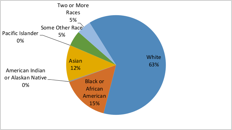
Figure 5.1 Proportion of Public Transit Riders by Race (ACS 2013)
Figure 5.2 shows the spatial distribution of the proportion of public transit commuters who identify as White, and not-Hispanic/Latino. The proportion of White riders is higher near Heavy Rail lines, in select neighbourhoods and towns in the inner core such as South Boston, Charlestown, the Back Bay, and Cambridge, or out in the suburbs. Minority ridership tends to concentrate in the Urban Core in the space between Heavy Rail lines or in a few suburban towns such as Randolph and Lynn.
However the map below doesn’t reflect absolute numbers of commuters. The dot map in Figure 5.3 below represent 10 commuters by one dot randomly placed within the census tract boundary. Thus intensity can be shown by the concentration of the dot color, while avoiding the issue of larger tracts on the periphery being more noticeable due to their size rather than their intensity. The geographic separation of Black and White commuters is still noticeable, in particular south west of downtown Boston and the drop in the number of commuters outside of the core served by rapid transit is now noticeable.
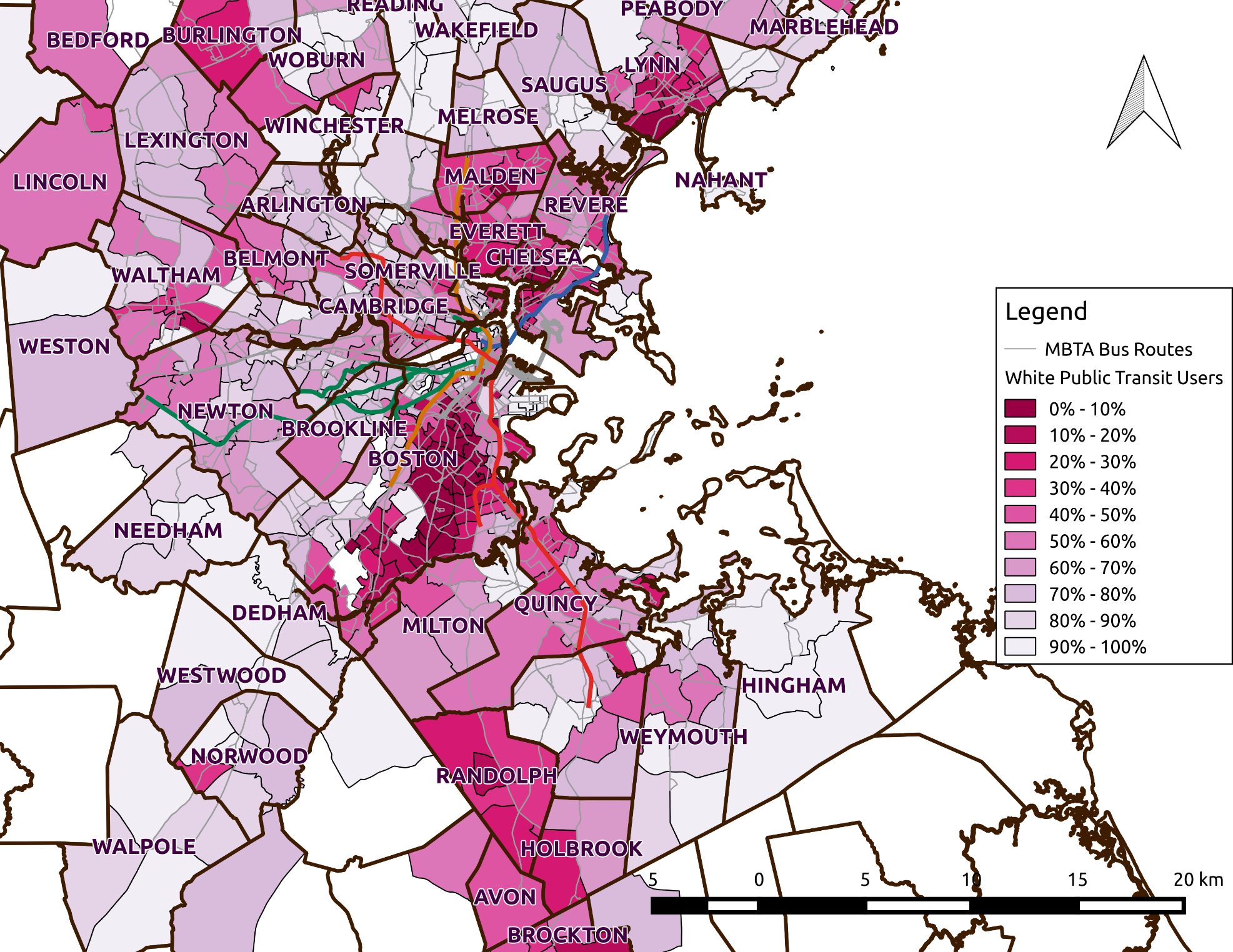
Figure 5.2 Proportion of Public Transit Users who are White Alone, not Hispanic or Latino (ACS 2013
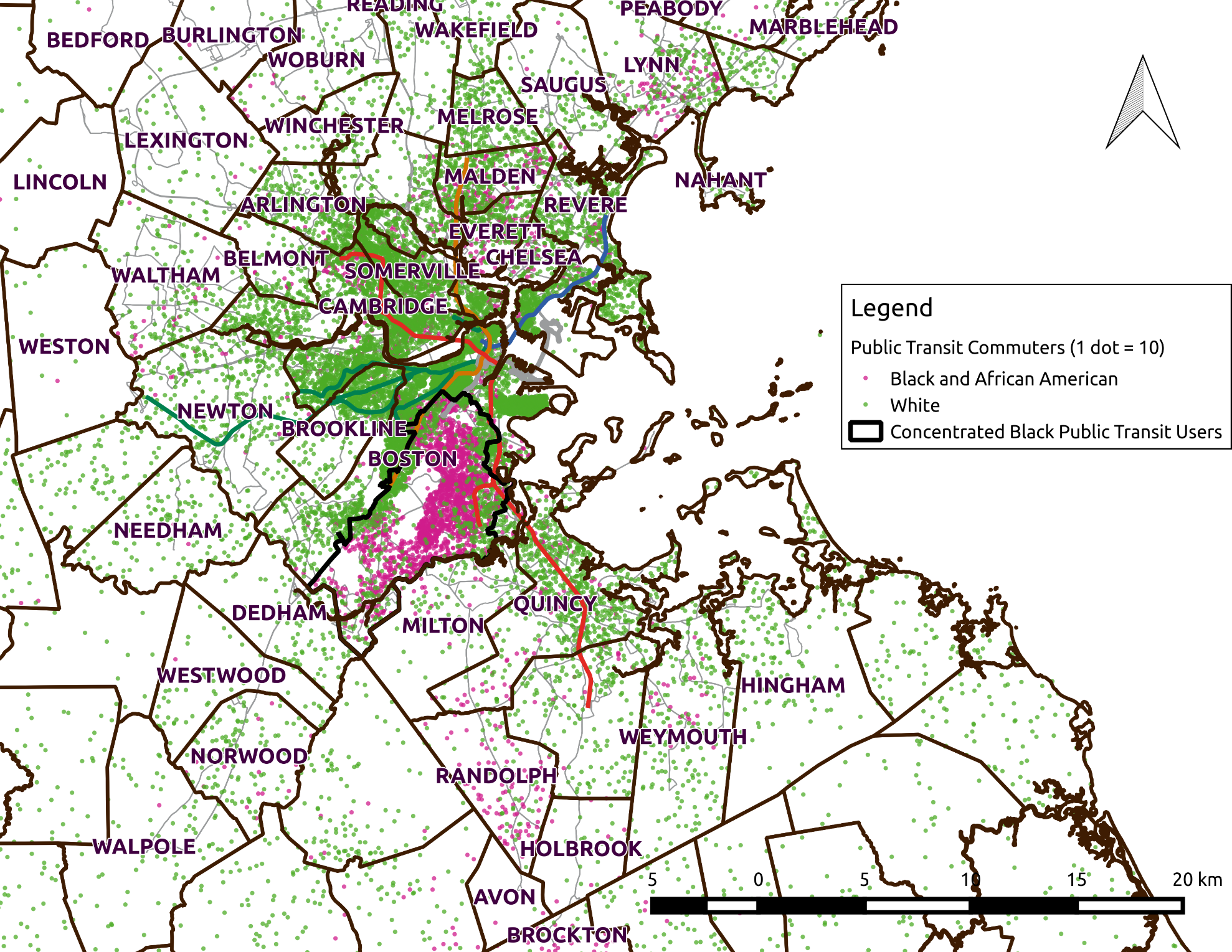
Figure 5.3 Dot Map of Public Transit Commuters Identifying as White or as Black and African American (ACS 2013)
Inferred Weekday Home-based Journeys
As described in the previous chapter, AFC farecards are linked to census tracts by estimating the probability that the user of that farecard resides in a particular tract based on the intersection of a user’s home area with the tract geometry. Figure 5.4 shows the distribution of the density of farecards across the metropolitan area.
Of the 4.23 million first weekday journeys that regular commuters took in April 2014, 3.38 million (79.8%) started from that user’s inferred home and 1.96 million (46.3%, for a destination inference rate of 58.0%) of those have an inferred destination and arrival time. Figure 5.5 maps the distribution of destination inference rates by tract. Given that destination inference rates are higher for transactions on the subway rather than bus, there is a sampling bias in favor of heavy rail trips as well as tracts located near heavy rail stations.
Performance Metrics for All Journeys
This analysis first examines the travel time of users’ home-based journeys to determine whether the travel time difference highlighted by Williams et al. (2014) can be found in the AFC data. Connected to travel times are the distances travelled. If certain users are travelling longer, but this is due to covering greater distances from their homes, then there may be policy implications, but it is not a failure of the public transit network.
This section will examine journey characteristics for the entire network to set a baseline before examining journeys by the demographics of their originating tracts in section 5.4. Figure 5.6 shows the distribution of journey straight line distances whereas Figure 5.7 shows this same distribution averaged by census tract. Due to the heterogeneity of behavior within each tract, when journey distances are averaged by tract the shortest average trip distance is 3km when approximately 20% of the individual trips are shorter.
Waiting times are not recorded in the ODX output when a bus stage is the first stage of a user’s journey since payment occurs after waiting at the stop. For rail journeys, fare payment occurs before waiting for a vehicle, and for multi-stage journeys, the transfer time between the arrival of one stage and the departure of the next includes waiting time at the stop. Waiting time is inferred for bus stages in section 5.4.1. Given the assumptions required in its inference, results will first be compared by disaggregating statistics by mode, such that journey times with recorded waiting times are not compared with journey times lacking waiting time.
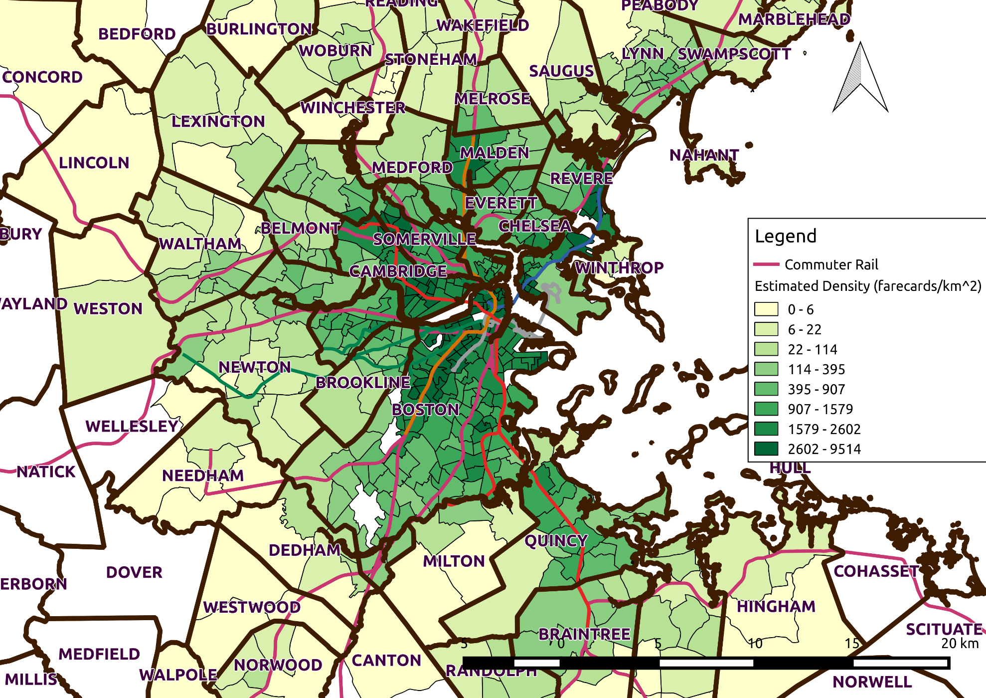
Figure 5.4 Map of Farecard Density by Census Tract
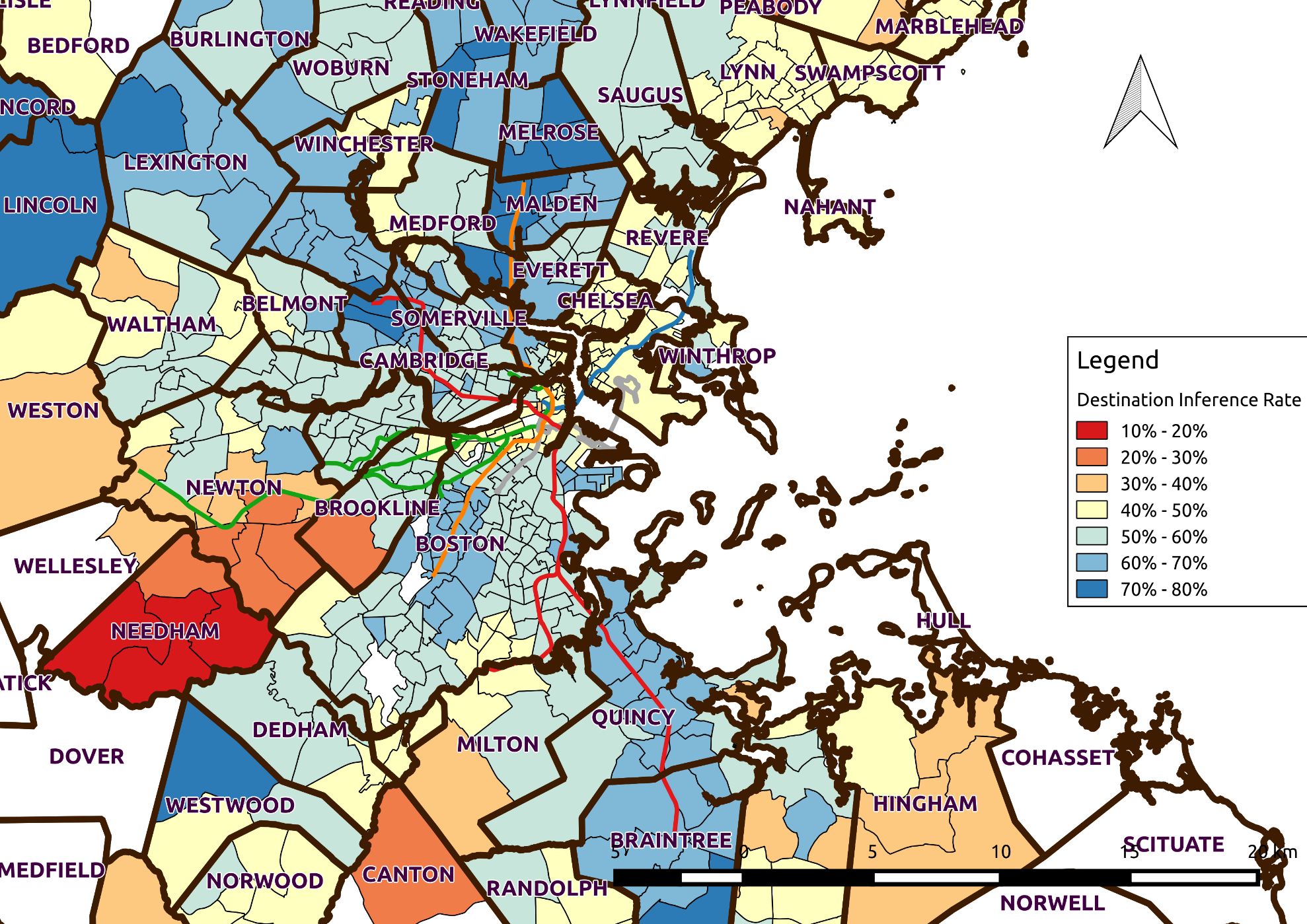
Figure 5.5 Destination Inference Rate by Census Tract
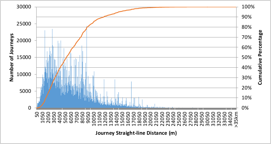
Figure 5.6 Distribution of Straight-Line Distance by Journey
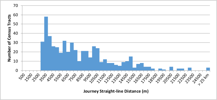
Figure 5.7 Average Straight-Line Journey Distance by Census Tract
Figure 5.8 shows the distribution of travel times by mode while Table 5.1 shows journey time, travel time, and the number of segments averaged by each mode. The “Rail” label applies to any journeys involving the rapid transit network, including the Silver Line Waterfront. Mixed refers to a combination of bus and rail. Segments take into account transfers behind the gate. Distances are measured as a straight-line from origin to destination, in order to capture their proximity, rather than detours taken by the transit network.
As one would expect, bus is used for shorter journeys than rail. Rail alone is used for the bulk of journeys and travel times are typically between bus and a combination of bus and rail (mixed). Mixed mode journeys are longer because they are journeys involving a bus stage to or from a rail stage in the inner core and on average, they cover more distance.
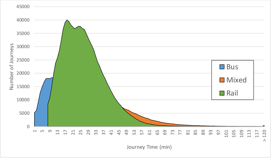
Figure 5.8 Distribution of Journey Time by Mode
Table 5.1 Journey Averages by Mode
| Journey Mode | Average Journey Time | Average Speed (km/hr) | Average Straight-Line Distance (m) | Average Number of Segments | Number of Journeys |
|---|---|---|---|---|---|
| Mixed | 41.7 | 12.4 | 8647 | 2.31 | 315,618 |
| Bus | 18.2 | 14.0 | 3855 | 1.14 | 450,781 |
| Rail | 26.1 | 14.0 | 6316 | 1.22 | 1,058,094 |
The map in Figure 5.9 below shows the spatial distribution of average journey times by tract. Since travel time is only inferred for journeys that start at a gated station, there are artifacts along the surface portion of the Green Line because journeys on that segment are not used. Besides these, the pattern resembles what one might expect from a largely radial system: shorter travel times in the center, growing longer as the distance from the center increases. There exist a few outliers outside the center which are likely due to there being few trips originating from those tracts.
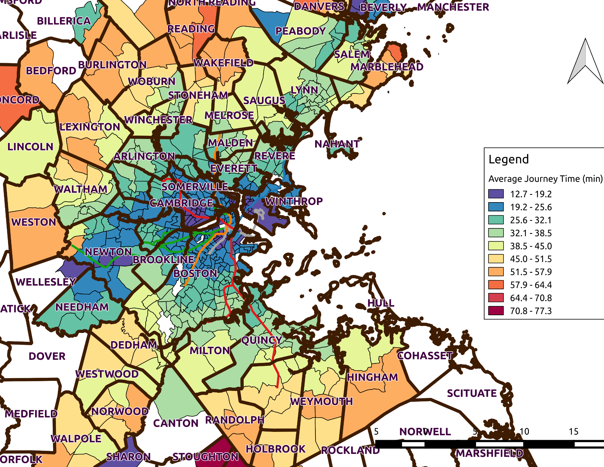
Figure 5.9 Map of Average Journey Time by Census Tract
Threshold Selection
In the absence of being able to directly link a race/ethnicity to a farecard, geographic thresholds must be used: tracts are selected based on demographic thresholds and outcomes for the sampled populations are compared. Due to the geographic aggregation, this results in “noise” being introduced, since populations are not homogeneous within tracts (Karner & Niemeier, 2013), even though, as Figure 5.3 showed, White Alone and Black/African American commuters are geographically separated.
As per FTA guidelines, the thresholds are selected based on the proportion of each demographic in the service area. Unlike CTPS analysis, which includes the entire commuter rail catchment area, the area used here are census tracts which intersect MBTA bus or rapid transit lines. For this service area, the proportion of Black and African American public transit commuters is 15.3% (37,444 commuters) and the proportion of White Alone is 56.1% (136,583 commuters), shown in the second column of Table 5.2. Two mutually exclusive samples are selected using these two proportions as thresholds, while excluding tracts which meet both thresholds, thus:
- White tracts have a proportion of 56.1% or greater White Alone commuters and fewer than 15.3% Black or African American commuters
- Black tracts have a proportion of 15.3% or greater Black or African American commuters and fewer than 56.1% White Alone commuters
Table 5.2 shows that over 75% of Black commuters reside in tracts meeting the Black threshold, and 73% of White commuters reside in tracts meeting the White threshold. Despite this, Black or African Americans make up only 46% of commuters in tracts meeting the Black threshold, resulting in the overrepresentation of the experiences of other transit demographics in that sample. On the other hand, a majority of commuters in the White tracts identify as White Alone (78%).
Table 5.2 Tract Demographics for Black or White Thresholds
| All Tracts | Tracts Above Black Threshold | Tracts Above White Threshold | Tracts Above Both Thresholds | |
|---|---|---|---|---|
| Black Commuters | 37,444 | 28,504 | 4,421 | 1,765 |
| Proportion of Black Commuters | 100% | 76% | 12% | 5% |
| Black Proportion of Commuters | 15% | 46% | 3% | 22% |
| White Alone Commuters | 136,583 | 15,692 | 99,461 | 5,173 |
| Proportion of White Commuters | 100% | 11% | 73% | 4% |
| White Proportion of Commuters | 56% | 25% | 78% | 64% |
| All commuters | 243,334 | 61,762 | 127,575 | 8,034 |
Selecting Appropriate Thresholds
Though the FTA has explicit guidance on how to select thresholds, Karner & Niemeier (2013) recommend that equity analyses should examine sensitivity of the results to the threshold used. Prior to selecting a threshold to use for an in-depth analysis of trip characteristics, this section examines how varying the threshold affects the demographics and the performance metrics of the resulting samples. The demographics and performance metrics of the sample are calculated for a sample formed by using each integer threshold between 0% and 100% for the White Alone and Black or African American demographics.
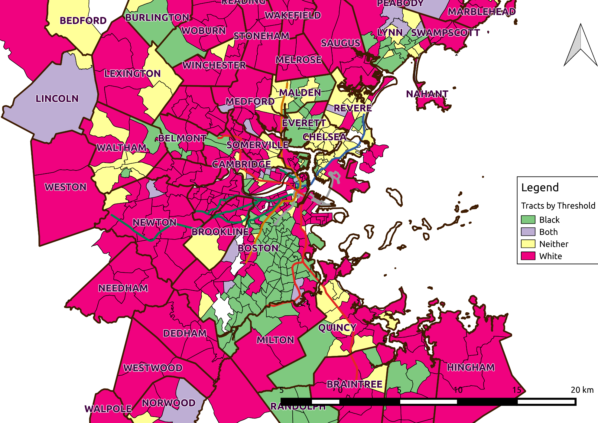
Figure 5.10 Census tracts above FTA Black or White commuter threshold
How Varying the Threshold Changes the Sample Demographics
In selecting a threshold one wants to ensure that the sample has a high concentration of that demographic ((P_{\text{di}}), see Equation 51) while ensuring a good representation of the target demographic in the threshold ((R_{\text{di}}), see Equation 52). When selecting census tracts, as one increases the threshold for that target demographic, the proportion within the sample increases but as the sample size decreases so does the number of individuals matching the target demographic.
Equation 51 Concentration of target demographic within a sample
[C_{\text{di}} = \frac{\left( \text{Number\ of\ Commuters} \right){\text{di}}}{\left( \text{Number\ of\ Commuters} \right){i}}]
[\backslash n]
[R_{\text{di}} = \frac{\left( \text{Number\ of\ Commuters} \right){\text{di}}}{\left( \text{Total\ Number\ of\ commuters} \right){d}}]
Where:
[{d:\ target\ demographic,\ ex:White\ Alone\ or\ Black\ or\ African\ American\ \backslash n}{i:sample\ of\ commuters\ meeting\ the\ given\ threshold}]
The FTA guidance requires thresholds to be based on area averages, however these can be overly restrictive or overly permissive depending on the circumstance. Figure 5.11 and Figure 5.12 show how the representation of Black or African American commuters, and White Alone commuters varies by varying the threshold of Black or White commuters respectively. In order to be mutually exclusive, each sample excludes tracts exceeding the area proportion for the other demographic. For:
- White Alone tracts: Any tract exceeding 15.3% Black or African American commuters is excluded
- Black or African American tracts: Any tract exceeding 56.1% White Alone commuters is excluded
For example, the tracts in Figure 5.11 exclude tracts exceeding the area average proportion of White Alone commuters. Selecting the most permissive threshold of 0% still results in 12% of Black or African American commuters being excluded from the sample (the green line). At the FTA threshold of 15.3% Black (the black vertical dashed line), 76% of Black commuters are included in the sample, but they are not a majority of commuters in the sample (the magenta line). By selecting a threshold between approximately 20% and 50%, the sample would ensure that Black or African Americans are the majority in the sample, while the majority of Black or African Americans are included in the sample. The reference population of White Alone commuters would be between 25% and below 10% (the blue line).
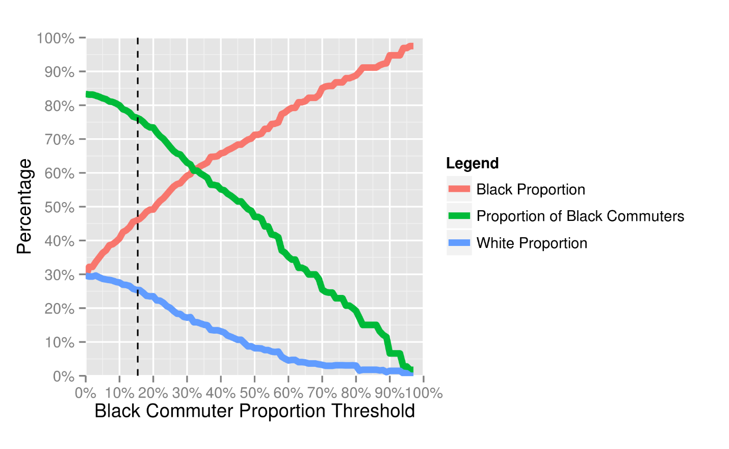
Figure 5.11 Sample Demographics as Black Threshold Varies
Figure 5.12 shows that White Alone commuters make up a majority of commuters in tracts that have a below average proportion of Black or African American commuters. Above the FTA threshold (the black dotted line), the sample has a majority White Alone population (78%) while including 73% of White Alone commuters. The sample would exclude a majority of White Alone commuters when using a threshold above 75%. Thus the FTA threshold would be inappropriate for selecting a sample of tracts housing Black or African American commuters, but would be reasonable for sampling the White Alone population.
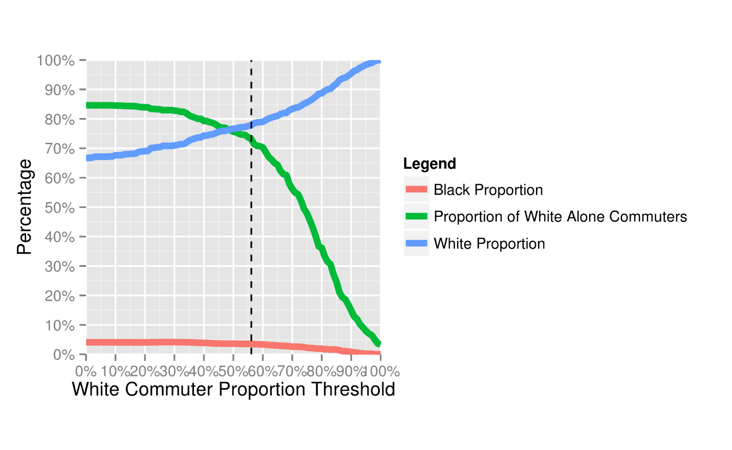
Figure 5.12 Sample Demographics as White Threshold Varies
For the 80 tracts which fall below both the White Alone threshold and the Black or African American threshold (see Figure 5.10 for their locations), Figure 5.13 shows their demographic breakdown. A majority of the 45,683 public transit commuters in these tracts are White, either non-Hispanic or White Hispanic.
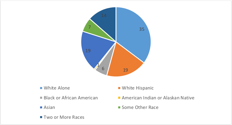
Figure 5.13 Demographic Proportion of Tracts below the FTA Thresholds for White Alone and Black or African American Commuters
How Varying the Threshold Affects Performance Metrics
After identifying a range of possible thresholds to select which balance the need to adequately represent a group within a sample with the need to have a sample with a high concentration of members of that particular demographic, the sensitivity of the results to the selected threshold should be examined. This section examines how the performance metrics of interest—speed and travel time—vary according to the threshold selected. For each threshold from 0% to 100% the average characteristics of the journeys from home for the sample are calculated by aggregating metrics by Census Tract, with the statistics being weighted by the probability of a farecard holder residing within that particular tract (see Chapter 4). By showing how the metrics change by changing the threshold the analyst can observe the presence of trends in the metrics as the proportion of a demographic increases. It also highlights whether a selected threshold is stable: does changing the threshold by a few percentage points have a dramatic impact on the results?
Figure 5.14 shows how the straight-line speed for each mode varies with the selected Black or African American threshold on the left plot, and the White Alone threshold on the right plot. The dotted lines show the average values for commuting trips for all races/ethnicities. Average rail and bus speeds are the same. Above the FTA threshold (the black vertical line), commuters in Black tracts have below average speed across all modes whereas commuters in White Alone have above average speed on bus and the combination of bus and rail. Though below average, rail trips for commuters from White Alone tracts are still faster than speeds from Black tracts.
Above the 70% threshold for Black or African American tracts and the 80% threshold for White Alone ones, the speed varies considerably as the sample shrinks to below 25% and 35% of the respective demographics.
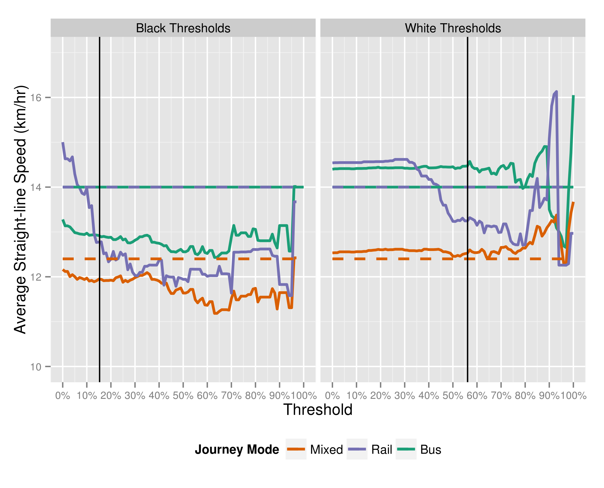
Figure 5.14 Average Straight-line Speed by Mode and by Varying Thresholds
Also notable is that journey speeds slow as the concentration of Black or African Americans in the sample increases. A similar phenomenon can be observed with White Alone rail speeds, though bus and mixed speeds indicate no clear trends.
Figure 5.15 shows that travel times tend to increase as the concentration of Black and African Americans increases. For all modes commuters in these tracts have above-average travel times. As with Figure 5.14 above, with thresholds above 70% for Black or African American tracts and 80% for White Alone ones, the averages become unstable as sample sizes shrink.
This increasing in journey times for commuters in Black or African American tracts is not due to these commuters living farther away as the concentration increases, Figure 5.16 shows that average journey distances do not increase as the threshold increases. Moreover, as one might expect due to their location, average journey distances are slightly shorter than for commuters from White Alone tracts. This also disproves the spatial mismatch theory that destinations are located further for Black or African American residents than for White ones.
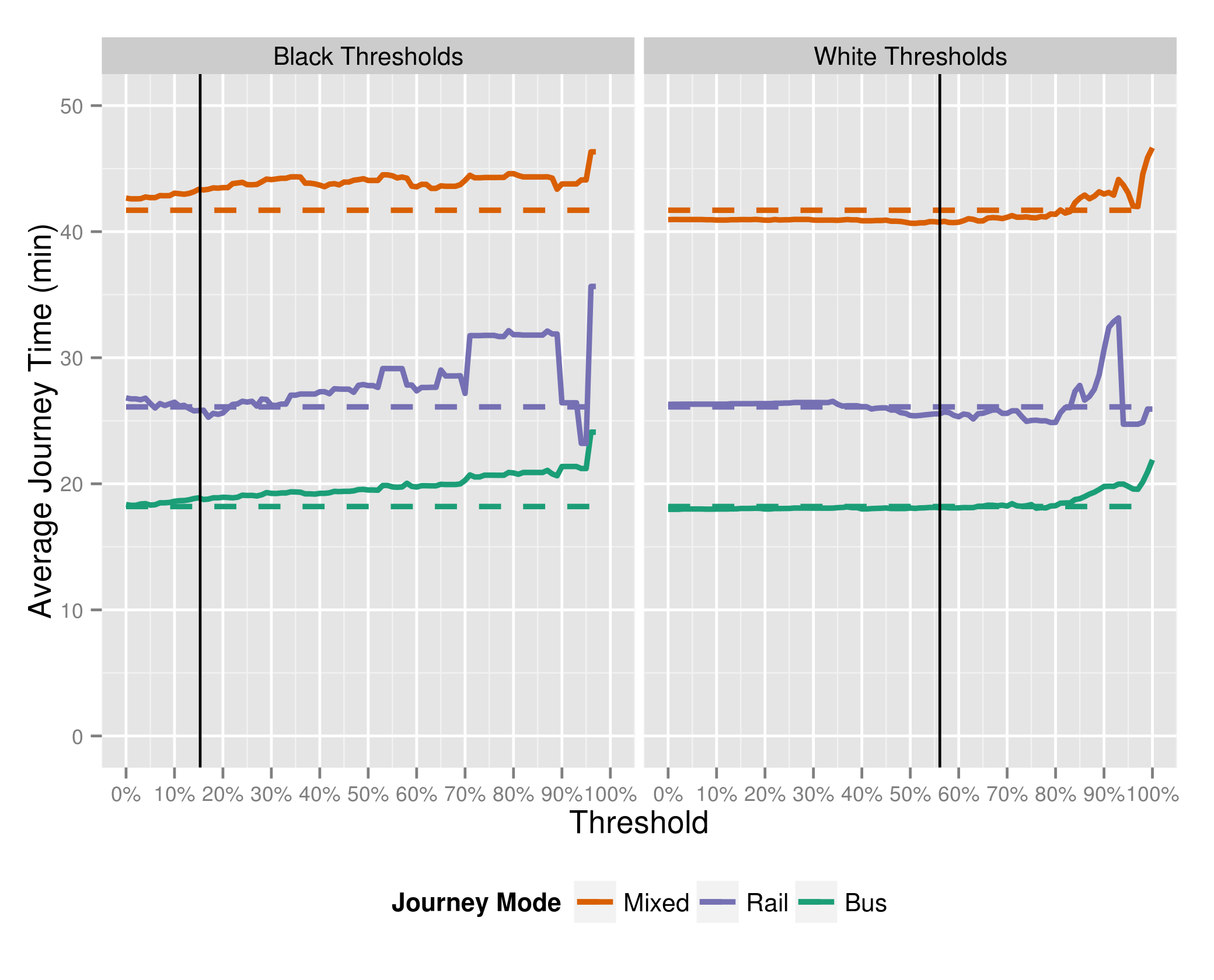
Figure 5.15 Average Journey Time by Mode for Varying Thresholds
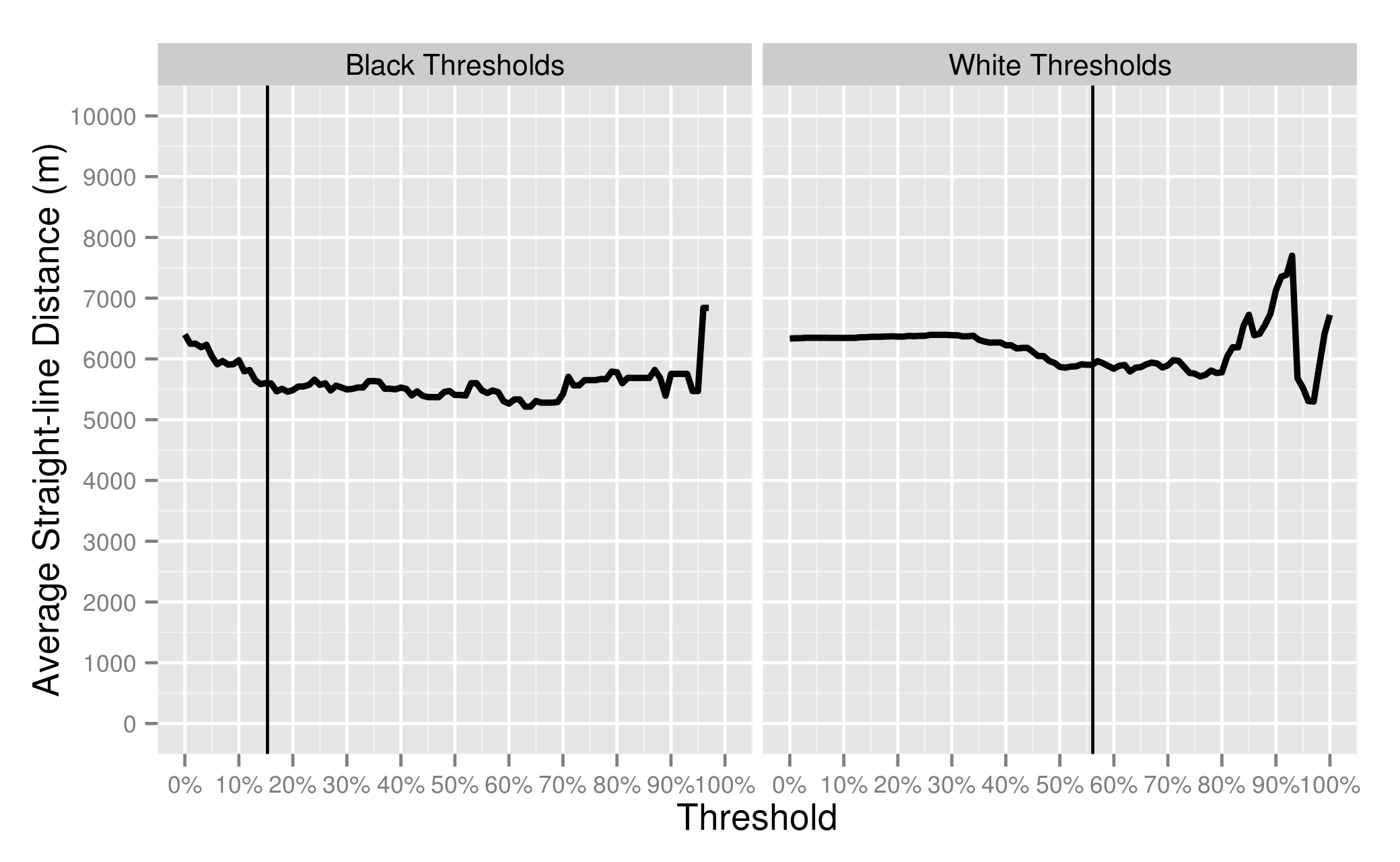
Figure 5.16 Average Straight-line Distance for Varying Thresholds
Despite no increase in journey distance as the concentration of Black or African American commuters increases, the number of transfers required to complete these journeys increases. The proportion of trips requiring at least one transfer increases from over 35% to 55% at a Black proportion of 70% (Figure 5.17). Over the same range the proportion of trips requiring at least two transfers increases by over 5%. Meanwhile the proportion of trips requiring more than 1 transfer for commuters from White Alone tracts barely goes above 35%. This indicates that the network is not currently configured to serve trips from Black or African American tracts very well, since shorter distances should not require more transfers.
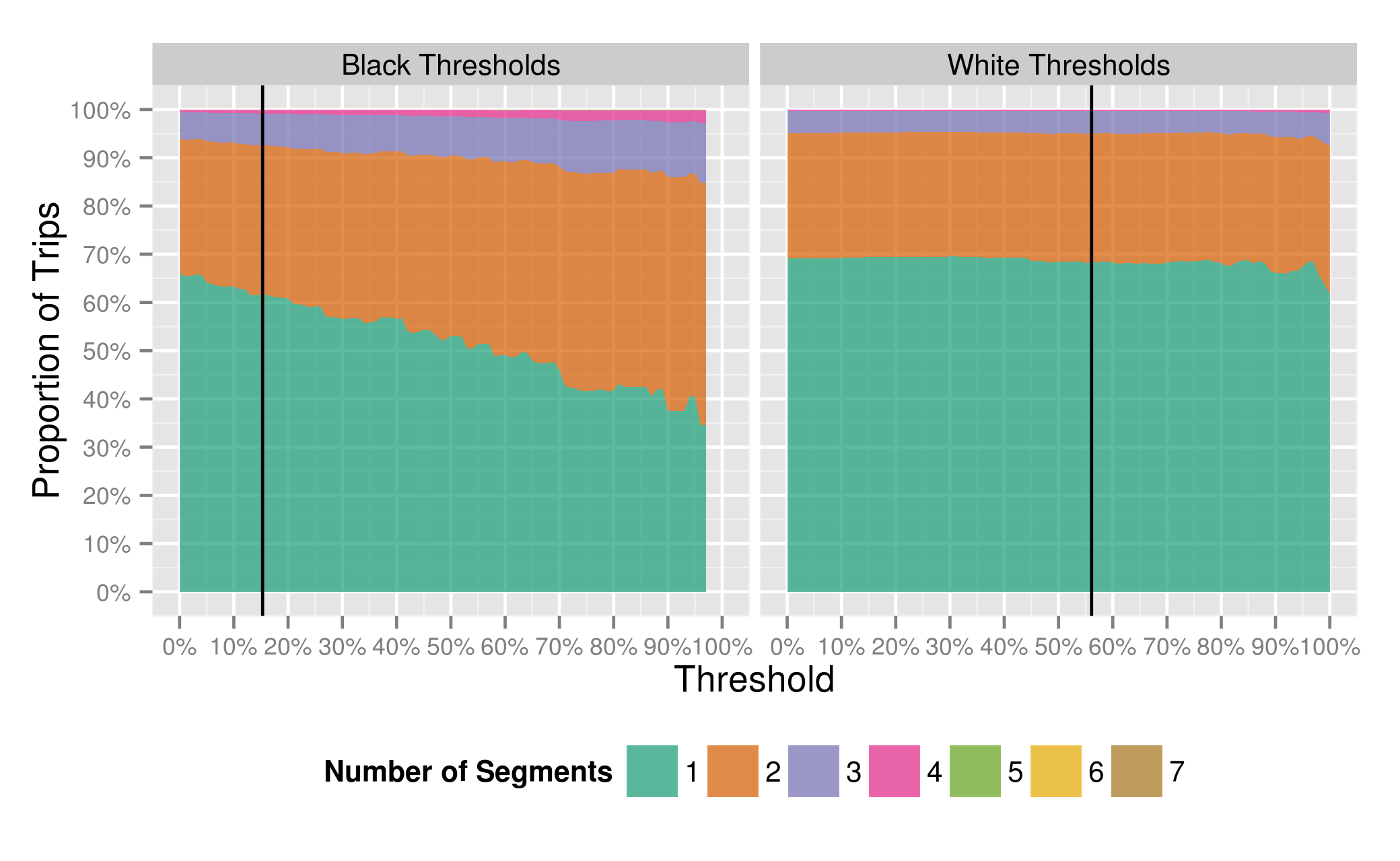
Figure 5.17 Number of Segments Required per Trip for Varying Thresholds
There is therefore evidence for a difference in journey speed (Figure 5.14) and journey times (Figure 5.15) between commuters in Black or African American tracts versus commuters in White Alone tracts. It is telling that a population with lower average distances travelled (Figure 5.16) who, given its location, should have better access, instead has longer travel times and lower speeds. This is partially due to these trips requiring more transfers (Figure 5.17), an indication that the network is not configured to serve these trips as efficiently as trips made from other zones. The increase in transfers causes an increase not only in actual travel time, but also in perceived travel time, as commuters tend to perceive waiting time as more onerous than in-vehicle travel time. It also decreases journey reliability, as the possibility of missing a connection increases potential journey time.
In the next section, distinct samples are selected to examine the reasons for these observed differences in greater detail. In order to have greater concentrations of either demographic in the samples, a Black or African American threshold of 40% and White Alone threshold of 70% are selected. The average travel times and speeds at these thresholds do not vary greatly with minor variations in the threshold and the thresholds provide a reasonable balance between having a high concentration of the demographics while still retaining a majority of either demographic in the sample.
Comparing Performance Metrics by Demographic Samples
Table 5.3 shows the demographics for the two samples used in this section with the White sample being tracts above 70% White Alone public transit commuters and the Black sample being tracts above 40% Black or African American public transit commuters. The target demographics make up a majority of commuters in their respective samples, while the samples still contain over 50% of the commuters of the respective demographics (55% of Black Commuters, and 57% of White Commuters).
Table 5.3 Tract Demographics for Black or White Thresholds
| Case | Tracts Above Black Threshold | Tracts Above White Threshold | Tracts Below Both Thresholds |
|---|---|---|---|
| Black Commuters | 20,641 | 2,651 | 14,132 |
| Proportion of Black Commuters | 55% | 7% | 38% |
| Black Concentration | 66% | 3% | 12% |
| White Alone Commuters | 4,130 | 77,903 | 54,494 |
| Proportion of White Commuters | 3% | 57% | 40% |
| White Concentration | 13% | 83% | 46% |
| Total | 31,378 | 93,568 | 118,308 |
| Number of Tracts | 61 | 252 | 230 |
Figure 5.18 shows a map of the tracts. The Black tracts are close to the core, and principally in the region between the southwest ends of the Orange and Red Lines. The White tracts within the core are downtown along the Orange and Red Lines or along the branches of the Green Line. Otherwise they are out at the termini of the Orange and Red Lines, and occupy most of the suburbs. One would expect the White Alone trips to be further, and bus trips to tend to be on express commuter buses.

Figure 5.18 Census Tracts above Black or White Commuter Thresholds (40% Black threshold, 70% White threshold)
Figure 5.19 shows the mode split by demographic. Commuters from Black or African American tracts tend to use bus and the combination of bus and rail much more than commuters from White Alone tracts.
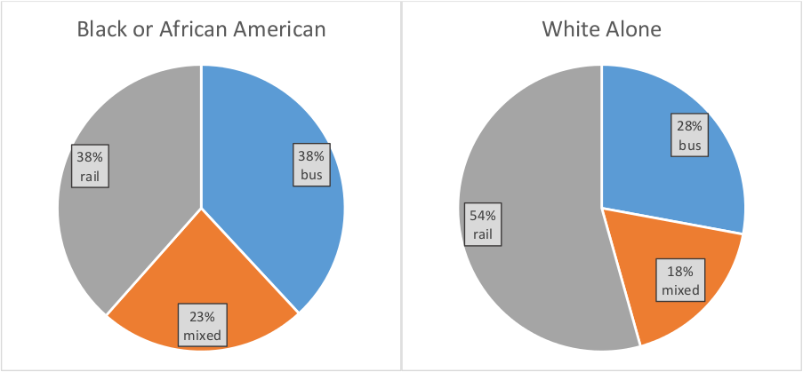
Figure 5.19 Mode Split by Demographic
Wait Time Inference for Bus Stages at the Beginning of a Journey
Since fare payment on bus trips occurs after waiting for a vehicle to arrive, waiting times are not recorded for the first bus stage of a bus journey. In order to compare journey times across modes, it is necessary to infer bus wait times to include them in journey times for trips where the wait time is unobserved.
In this section the waiting time was estimated for any bus stage at the beginning of a journey. For service with scheduled headways less than 10 minutes, passenger arrival times were assumed to be uniform and random, leading to waiting time estimates of Equation 53, or half the preceding headway. For the first bus trip of the day, there is no previous trip, the following headway is used as an estimate.
Equation 53 Waiting Time for High-frequency Service
[WT_{\text{is}} = \frac{1}{2}(AT_{\text{is}} - AT_{i - 1,s})]
Where:
(WT:) Waiting Time for a passenger boarding at stop (s) on trip (i)
(\text{AT}): Arrival Time for trip (i) at stops (s)
For scheduled service, with scheduled headways greater than 10 minutes, two methods were used to have bounded estimates of the waiting time. First, wait times were assumed to follow a similar pattern to high frequency service, of a uniform arrival rate resulting in a wait time of half the headway. This ignores that passengers may want to look up the schedule for lower frequency service. In the second assumption, passengers were assumed to arrive at the stop at a constant average time before the scheduled arrival time of five minutes, and then experience waiting time equivalent to the schedule adherence. This assumes that none of the users have access to real-time information, or that users don’t modify their “buffer time” before the scheduled departure based on previous experience of schedule adherence on that route. Nor does this penalize adequately the consequences of buses arriving at a stop early, which will result in some proportion of riders missing a trip and having to wait for the subsequent bus.
Table 5.4 shows the results for the two samples. The half-headway method leads to higher wait times for commuters from White Tracts, as it estimates waiting from longer headways much more severely. With the second method, the average wait times have one second of difference in favor of commuters from Black tracts. These commuters benefit from a slightly larger proportion of their bus trips starting on high frequency routes. For the rest of this section the lower wait time estimates will be used.
Table 5.4 Wait Times (min) by Threshold
| Threshold | Average Wait Time Half-headway | Average Wait Time Schedule-adherence | High-Frequency Trips |
|---|---|---|---|
| White Alone | 14:52 | 07:29 | 38% |
| Black or African American | 12:57 | 07:28 | 40% |
Table 5.5 shows journey characteristics for the populations in White Alone and in Black or African American tracts, disaggregated by mode. Given the number of journeys in the samples, the differences in average travel time and speed are all statistically significant beyond a 95th percentile level using a weighted t-test.
With wait time is included in all modes, it is possible to calculate an average travel time for each population by aggregating all trips across modes. This reveals the disadvantage commuters from Black tracts face due to relying more heavily on the much longer bus-to-rail mode (see modal split in Figure 5.19), with average travel times of 32.6 minutes to the 29.5 minutes of commuters from White tracts. This gap is greater than the gap of the individual modes due to the different mode splits and the relative travel times for each mode.
Table 5.5 Journey Time and Speed by Mode and Threshold
| Mode | Bus | Rail | Mixed | All Modes |
|---|---|---|---|---|
| Threshold | Black | White | Black | Black |
| Average Journey Time (min) | 26.8 | 25.5 | 50.5 | 27.3 |
| Average Speed (km/hr) | 7.9 | 9.4 | 10.3 | 12.4 |
| Average Straight Line Distance (m) | 3481 | 3985 | 8706 | 5611 |
| Number of Trips | 74,746 | 169,544 | 46,199 | 75,877 |
The difference of 1.9 min in rail average travel time is smaller than the travel-time penalties identified by Williams et al (2014) of 3.4 minutes for subway. The bus travel-time difference of one minute is also substantially less than the 8.4 minutes for bus identified by them (see Table 5.6 below). Trips taking a combination of modes are reported under the respondent’s choice of a “primary mode”. Overall the travel time difference observed in the AFC of 3.1 minutes is nearly half the 5.8 minutes gleaned from the ACS.
There are a few factors contributing to this. Since the ACS data is self-reported, differences in averages will be amplified due to respondents tending to report their travel times in 10 to 15 minute increments (see the graphs in Section 3.6.1 for examples of this). Given that commuters from Black tracts tend to transfer more, perceptions of transfer time might increase self-reported travel times.
Second, the average rail journey times are around 15 minutes shorter than the self-reported averages, and the bus travel times are 20 minutes shorter generally. This is because the AFC observations do not include access and egress times as part of journey time, whereas the ACS does. This implies that walking to access transit can be substantial, and that Black commuters on average may reside further from rail or bus lines.
Third, it is possible that the ACS data are simply inaccurately over-reported or weighted and that this leads to the large differences in travel times reported by Williams et al (2014).
Table 5.6 Average Journey Time Comparison between AFC and ACS (Williams, Pollack, & Billingham, 2014) Data
| Threshold | Black | White |
|---|---|---|
| Mode | Bus | Rail |
| AFC Journey Time (min) | 26.8 | 27.3 |
| ACS Journey Time (min) | 47.1 | 44.2 |
Nevertheless, across modes the AFC data show that commuters from Black or African American tracts have slightly longer average commute times than the White Alone population, despite shorter average distances. For reference, the travel times from White tracts are 91.4% those of Black ones. This ratio is higher than the 80% rule that CTPS uses with the FTA’s approval to determine impacts. Therefore these results do not trigger a call to mitigate these differences per the regulation. However, subsequent sections demonstrate the value of inferred OD in highlighting areas of operations where interventions might be effective in reducing this gap.
Analysis of Distributions of Metrics by Mode
Due to the assumptions required for inferring waiting times for bus stages, and because average waiting times were not found to be meaningfully different between the two samples, journey time and speed metrics in this section will not include inferred bus waiting times. Observed rail speeds are therefore lower because platform wait time is included in the inferred OD travel times.
The difference in travel speeds presented in Table 5.5 is partially due to users from Black or African American tracts making more transfers to get to their destination. Figure 5.20 shows that for a given distance, journeys from Black or African American tracts tend to require more transfers than those from White Alone tracts. Below that figure, Figure 5.21 shows the distribution of straight-line distances to indicate the relative frequency of trips being made of a given distance.
Of the 42% of trips from Black or African American tracts which are made between distances of 5 and 10 km, 56% of them require one or more transfers, compared to only 42% of trips from White Alone tracts over that same distance range. For journeys between 10 and 20 km, 9% of trips from Black or African American tracts, 81% of trips require more than one transfer, compared to only 53% of trips from White Alone tracts. This relative inaccessibility of the network, when, as the map in Figure 5.18 shows, Black tracts are mostly centrally located, suggests that the network has not been configured for the needs of Black or African American commuters. An increased number of transfers decreases trip reliability due to the possibility of a missed connection, and increases perceived travel time due to increased wait time.
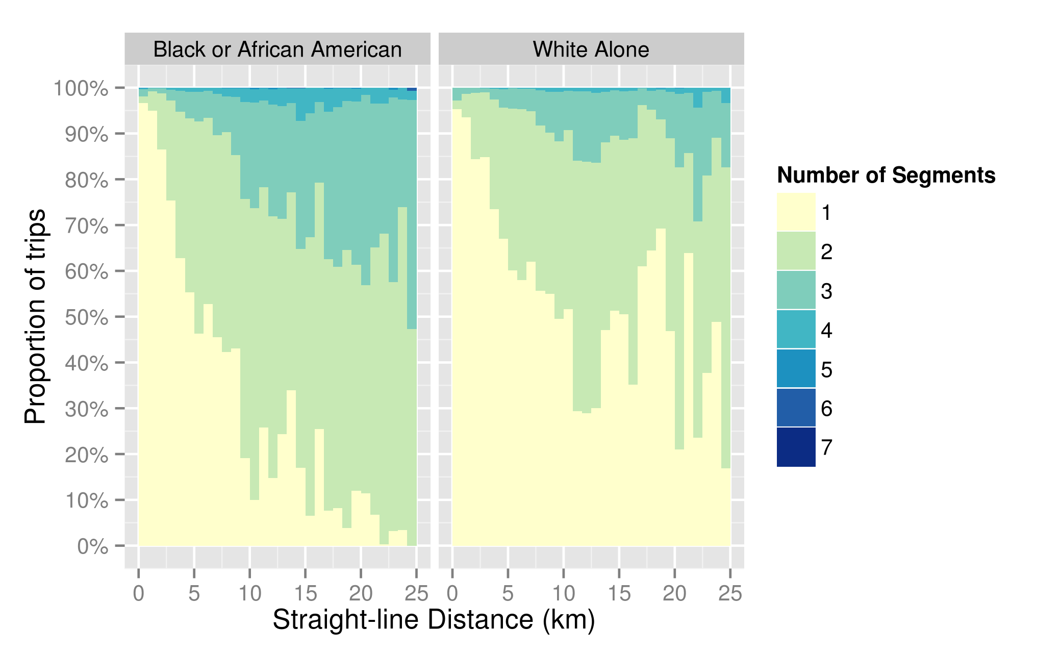
Figure 5.20 Distribution of Segments Required for Trips by Distance and Threshold
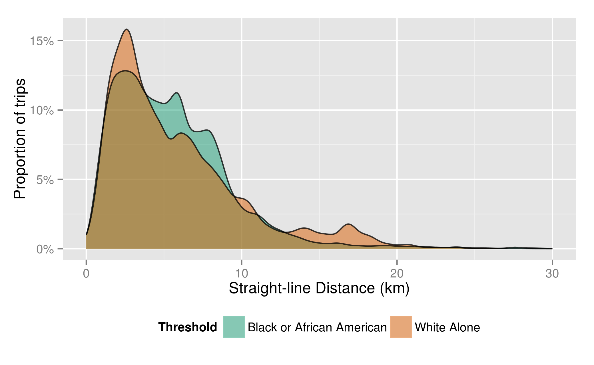
Figure 5.21 Distribution of Straight-Line Distance by Threshold
The increased number of transfers has implications for journey speed: average bus speed drops by 5km/hr after 1 transfer, as shown in Table 5.7. The table contains the average straight-line speed aggregated by mode, threshold, and number of segments while also showing the relative proportion of trips for a given mode requiring a given number of segments. Cells in the table with fewer than 100 trips were excluded.
Table 5.7 Straight-line Speed (km/hr) by Mode, Threshold, and Number of Segments
| Segments | Bus | Mixed | Rail | |||||||||
|---|---|---|---|---|---|---|---|---|---|---|---|---|
| Black or African American | White Alone | Black or African American | White Alone | Black or African American | White Alone | |||||||
| Speed | Trips | Speed | Trips | Speed | Trips | Speed | Trips | Speed | Trips | Speed | Trips | |
| 1 | 14.1 | 73% | 15.0 | 91% | 13.1 | 75% | 13.5 | 79% | ||||
| 2 | 9.3 | 25% | 9.7 | 8.7% | 12.5 | 69% | 13.1 | 76% | 10.5 | 23% | 10.7 | 20% |
| 3 | 8.1 | 2.1% | 7.8 | 0.4% | 10.9 | 26% | 11.3 | 22% | 5.7 | 1.8% | ||
| 4 | 8.4 | 4.6% | 8.8 | 1.7% | ||||||||
| Average | 12.7 | 14.5 | 11.9 | 12.6 | 12.4 | 12.8 | ||||||
Except for rail journeys with 3 segments, for no other combination do commuters from Black or African American tracts have faster average speeds, with the difference in speed greater for journeys with fewer segments, and in particular for single speed bus trips. The bus speed differential is the combination of slower speeds, and the need to transfer more often, leading to the differences in average speed in the bottom row.
The rail speed differential is a combination of trips being slower on the Ashmont branch of the Red Line, and more commuters from Black or African American tracts taking the slower Orange Line (see system schematic in Figure 2-3) as shown in Table 5.8. The greater speed on the Red Line can be explained by two factors: trips originating in downtown Boston, Cambridge and Somerville will have half the headways as trips on the branches because the trains from both branches run on the trunk. The second is that trips on the Braintree branch are likely faster because of greater stop spacing, and the trips are a longer distance, so platform wait time is a smaller component of the journey time. The Green Line trips originate in the Central Subway and neither sample had a substantial proportion of trips on the Blue Line.
Commuters from White Alone tracts benefit from faster average bus speeds because they are sometimes riding express commuter buses from the suburbs to downtown Boston. Figure 5.22 shows the relationship between average speed and distance for each mode, speeds are averaged by 500m distance bin. Bins with fewer than 210 trips, or 10/weekday, were excluded from the graph. Below it, for reference, Figure 5.23 shows the distribution of trips for each mode by distance.
Table 5.8 Rail Speed by Line for Trips with only 1 Segment
| Line | Average Straight Line Speed(km/hr) | Proportion of Trips | ||
| Black or African American | White Alone | Black or African American | White Alone | |
| Green | 6.6 | 7.4 | 1.4% | 8.6% |
| Orange | 12.2 | 11.9 | 44.8% | 32.0% |
| Red | 14.1 | 15.2 | 53.8% | 59.1% |
Speeds tend to increase with distance, and, for reasons identified above, speeds are lower for trips from Black or African American tracts. The difference is starkest for bus trips between 5.5 and 11km long, 13% of trips from Black or African American tracts, where the difference in speed can exceed 10km/hr, though the difference in average over the range is 7km/hr. This appears to be primarily due to a much greater need to transfer over those distances for commuters from Black or African American areas (Figure 5.24); 72% of trips require at least one transfer compared to only 22% of trips from White tracts. Additionally, a greater availability of faster express buses from White suburbs to the downtown core is also an important factor.
Between 3 and 4km, the location of the peak in White Alone bus trips, the average speed for White Alone trips is actually 0.7 km/hr slower than for Black or African American trips. However, this is mitigated by speeds below 3 km being faster for White Alone trips. Aggregating bus trips from 500 to 4000m, which include 69% of Black or African American bus trips and 65% of White Alone ones, shows no difference in average speed. This reveals the importance of examining distributions, since the speed difference is null in the range where the bulk of bus trips are made, but the difference is substantial over medium distances.
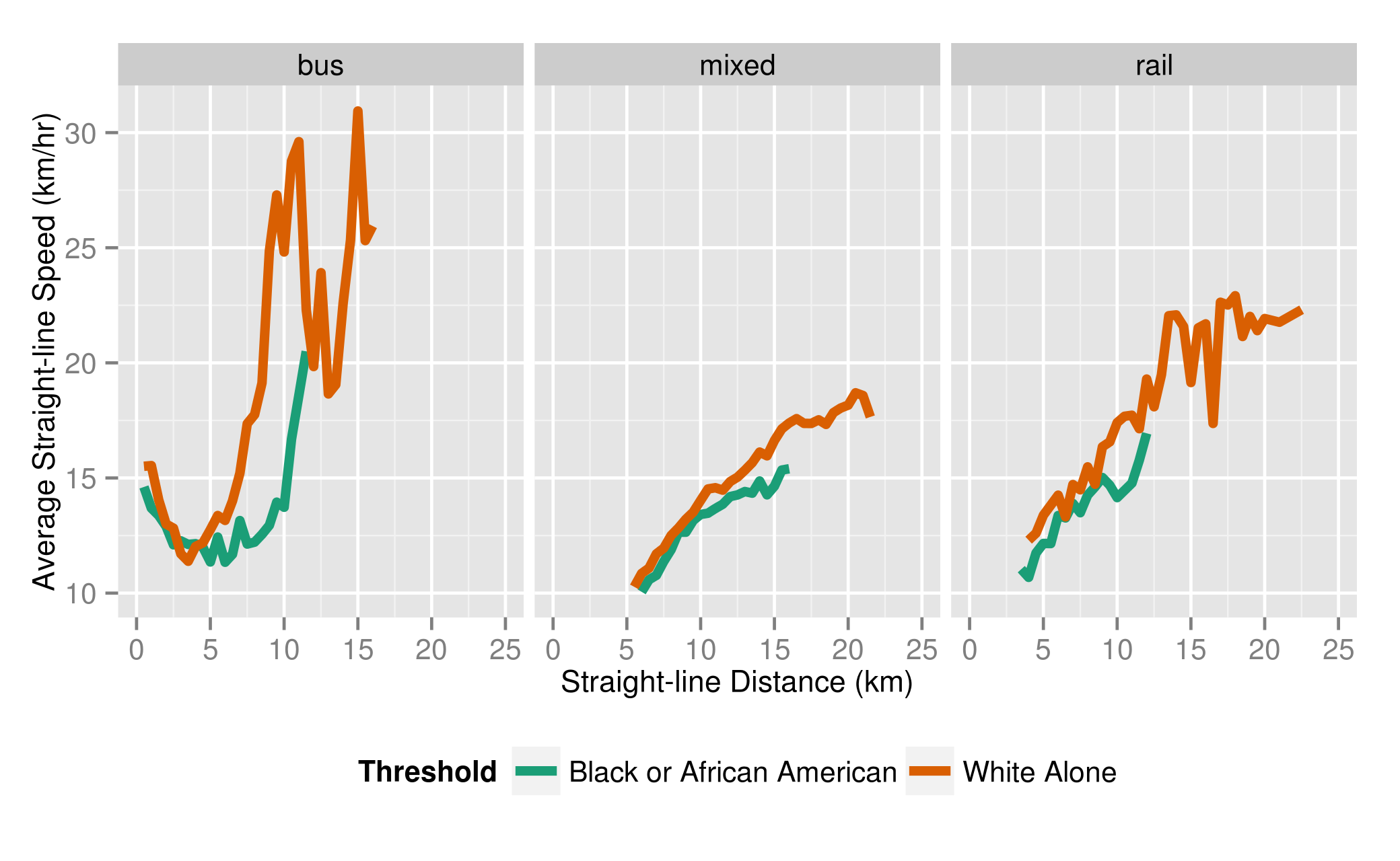
Figure 5.22 Average Straight-line Speeds by Journey Distance and by Mode
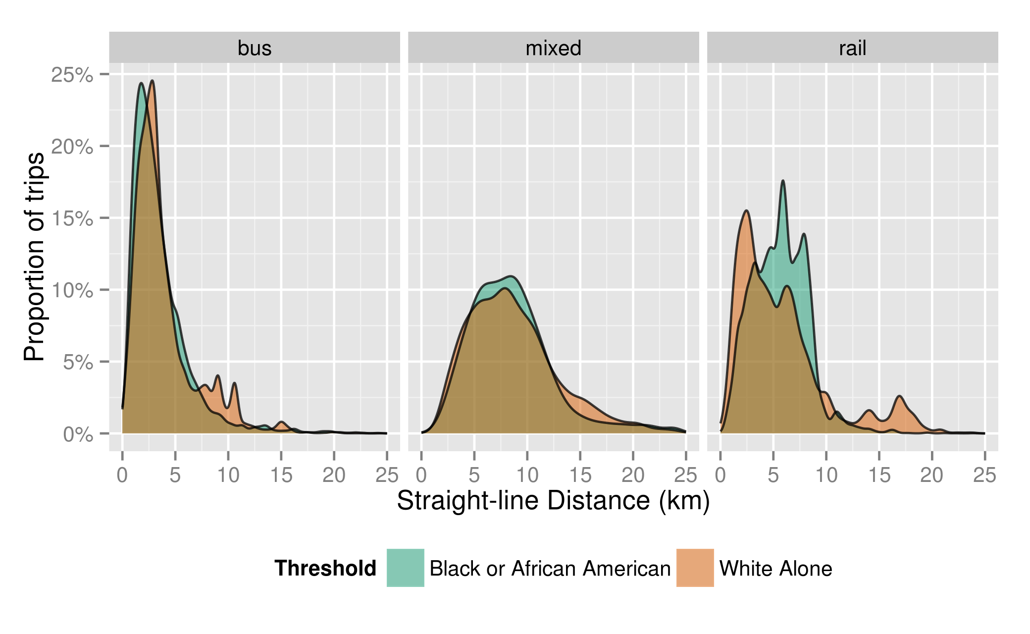
Figure 5.23 Journey Straight-line Distance Distributions by Mode
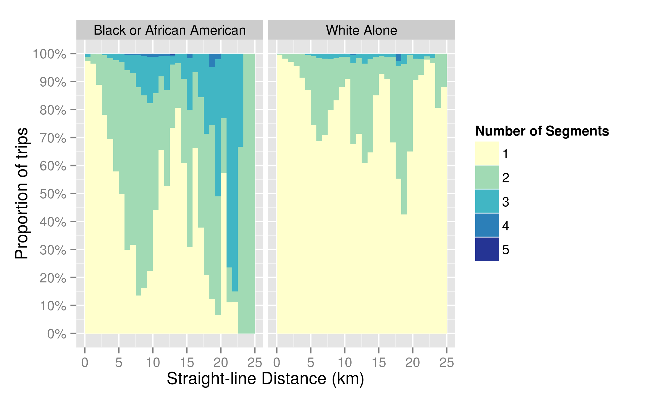
Figure 5.24 Distribution of Bus Segments Required for Trips by Distance and Threshold
Figure 5.25 shows the distributions of start times for the journeys in both of the samples. For all modes commuters from Black tracts have a greater spread of start times than those from White tracts, with the difference in distributions greatest for bus trips. The greater proportion of trips outside of the peak could play a factor in lower trip speeds. In order to investigate whether this spreading of travel start time lowers average speeds, Table 5.9 shows how average speeds vary by time of day.
Average speeds are typically faster in the early morning and then slow as the day progresses. However, speed differentials exist independently of time of day: for most time periods average journey speeds are lower for commuters from Black tracts. Speed differences in the AM Peak, of 1.9 km/hr, 0.5 km/hr, and 0.4 km/hr for bus, mixed, and rail respectively, are comparable to the average speed differences by mode of 1.8 km/hr, 0.7 km/hr, and 0.4 km/hr excluding bus waiting times. For bus, that the average speed difference in the midday is slightly lower than the difference in the peak implies that the higher speeds, and higher proportion of trips with those higher speeds, in the off-peak periods except midday school reduces the average difference for that mode. For mixed journeys, the slower speeds and greater difference in speeds in off-peak periods result in increasing the average difference in journey speed by 0.2 km/hr.
Table 5.9 Speed (km/hr) by Time Period Hour, Mode, and Race
| Time period | Bus | Mixed | Rail | |||||||||
| Black | White | Black | White | Black | White | |||||||
| Speed | Trips | Speed | Trips | Speed | Trips | Speed | Trips | Speed | Trips | Speed | Trips | |
| Night/Sunrise [12AM,6 AM) | 16.3 | 7.9% | 19.1 | 3.3% | 13.2 | 9.5% | 14.4 | 5.0% | 12.6 | 5.4% | 16.0 | 4.1% |
| Early AM [6 AM,7 AM) | 14.0 | 13% | 17.3 | 11% | 12.7 | 18% | 14.4 | 16% | 13.4 | 10% | 15.5 | 9.5% |
| AM Peak [7 AM,9 AM) | 11.9 | 35% | 13.8 | 53% | 11.8 | 42% | 12.3 | 55% | 12.5 | 51% | 12.9 | 54% |
| Midday Base [9 AM,13:30) | 12.5 | 35% | 14.3 | 29% | 11.4 | 25% | 12.1 | 21% | 11.9 | 29% | 11.9 | 29% |
| Midday School [13:30,16:00) | 11.7 | 8.0% | 13.7 | 5.0% | 10.9 | 5.3% | 11.7 | 2.9% | 11.5 | 5.1% | 11.1 | 4.1% |
| All | 12.7 | 14.5 | 11.9 | 12.6 | 12.4 | 12.8 | ||||||
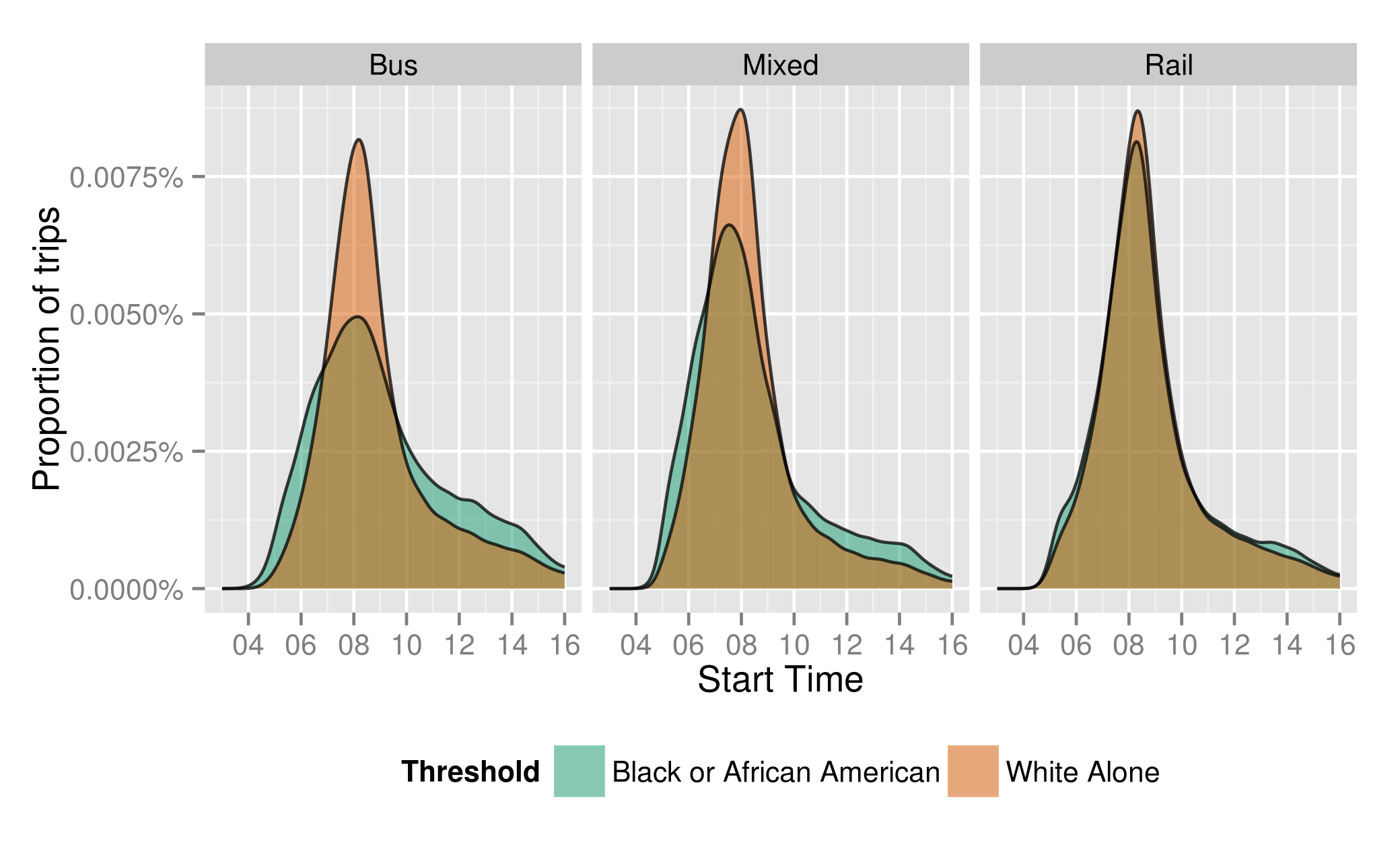
Figure 5.25 Distribution of Start Times by Mode and Threshold
Rail is the only mode where journey speeds from Black tracts meet or exceed those from White tracts. This happens during the midday periods. Table 5.10 explores in greater depth the potential reasons for travel speed differences for heavy rail users by time of day, and why the gap might close during the midday. The “%Trips” column shows the proportion of trips made during that time period by users for a given sample on a given mode. Because only trips beginning on lines with substantial ridership are included, the values in %Trips will add up to close to 100% for a given sample and time period.
The faster average speeds experienced by commuters from Black tracts during the early AM period is due to a combination of faster speeds on both the Orange and Red lines, as well as a greater proportion of trips being made on the faster Red Line, with the proportion of trips on the Red Line decreasing as the day progresses. The big differences in speed observed in the early morning appear to be due to commuters from White tracts having substantially faster speeds in the early morning on the Red Line, between 3 and 4 km/hr faster than during the peak. This is likely due to better headways on the trunk and could be partially remedied by increasing headways on the Ashmont branch in the early morning, where a greater portion of trips from Black or African American tracts start than in the peak
The closing of the gap during the midday is due to a combination of the gap in Red Line speeds decreasing and a shift in trips from White Tracts to slower lines like the Orange Line and the much slower central subway of the Green Line.
Table 5.10 Average Heavy Rail Speeds (km/hr) for the Orange and Red Lines by Time of Day, Threshold, and Number of Segments
| Time Period | Black or African American | White Alone | ||||||||
| Orange Line | Red Line | Green Line | Orange Line | Red Line | ||||||
| Speed | %Trips | Speed | %Trips | Speed | %Trips | Speed | %Trips | Speed | %Trips | |
| Sunrise | 11.8 | 37.5% | 13.1 | 62.2% | 7.7 | 3.6% | 12.3 | 33.9% | 18.5 | 61.9% |
| Early AM | 12.2 | 37.8% | 14.2 | 61.5% | 7.8 | 5.4% | 12.9 | 34.6% | 17.7 | 59.6% |
| AM Peak | 11.6 | 44.1% | 13.5 | 54.2% | 7.5 | 9.3% | 11.5 | 32.5% | 14.5 | 57.9% |
| Midday Base | 11.1 | 47.3% | 13.0 | 50.7% | 7.0 | 12.2% | 10.7 | 31.3% | 13.6 | 56.1% |
| Midday School | 10.7 | 50.2% | 12.5 | 47.8% | 6.7 | 15.6% | 10.5 | 33.6% | 12.8 | 50.3% |
All of the factors discussed above lead to the distributions of travel times by mode in Figure 5.26 below. Commuters from Black or African American tend to have both shorter and longer bus trips than those from White Alone tracts. The latter is due to medium-length trips being slower and requiring more transfers. For trips requiring a combination of bus and rail, the distribution of journey times is overall longer for commuters from Black tracts, again due to slower speeds and more transfers required. For rail trips, the middle of the distribution is shifted to the right for commuters from Black or African American tracts due to the relative speed of the Orange Line and Ashmont branch of the Red Line versus the trunk and Braintree branch of the Red Line. The next section, 5.4.3, will explore more specific areas for improvement based on these finding, leading to strategies to reduce these travel time differences that are suggested in section 5.6 below.
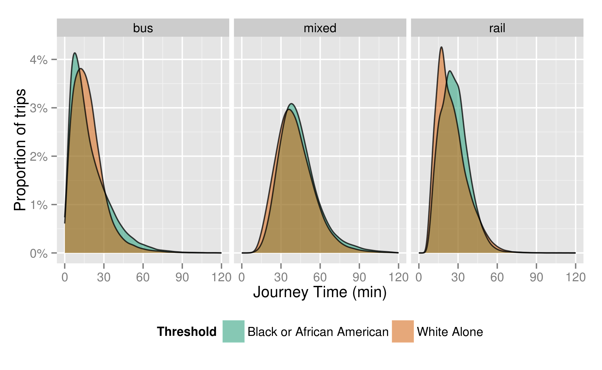
Figure 5.26 Journey Time Distribution by Tract Threshold and Mode
Mode-level Analysis
Having identified the aggregated sources for differences in travel times in the preceding section, this section identifies looks at routes and combinations of routes where aggregate passenger-time from users in Black or African American tracts is greatest in order to identify potential solutions to be further discussed in section 5.6. Since one of the contributors to lower travel time speeds is the increased number of transfers required to reach destinations, it is possible to identify route pairs which could be good candidates to merge. For commuters using heavy rail only, the speed difference was primarily due to a greater reliance on the slower Orange Line and using a slower branch of the Red Line, neither of which can be easily resolved.
Bus Trips Travelling between 5.5 and 11km
As identified in Figure 5.22 above, the 13% of bus trips travelling these distances exhibited the greatest difference in speeds between commuters from Black tracts and those from White tracts. By aggregating journey times by bus route combination, in this case using only in-vehicle and transfer times, it is possible to query and find the bus routes on which aggregated passenger-minutes for trips going these distances is the greatest. Ordering by this combined metric shows for which routes speed improvements would benefit a combination of numerous riders and riders with long travel times and have the largest effect on reducing travel time differences.
The routes listed in Table 5.11 are the 15 route combinations for users travelling between 5.5 and 11 km with the most passenger-minutes spent travelling on them. The third column displays this metric as a percentage of the total passenger-time spent making journeys in this range, to give an indication of how much passenger-time could be affected by speed improvements. For routes where this proportion is larger than the proportion of trips made in this range, passengers taking this route combination spend on average more time travelling than the average passenger in this distance range. Most of the route combinations in the table listed involve a transfer because 72% of trips in this distance range require a transfer, which slows down travel.
The table also shows how dispersed travel patterns are in this range, these fifteen route combinations only account for 38% of trips and 35% of the time spent travelling in this distance range, so single interventions can have limited impact on the overall travel times of users. However, some routes such as the 28 and the 23, which share Warren Avenue from its intersection with Blue Hill Avenue until Dudley Square and continuing to and then terminating at Ruggles, appear in a number of combinations. The two routes carry 22% and 10% of passengers respectively. So Warren Avenue could be a good candidate for improvements to bus speeds such as transit signal priority or queue jumping, which can save time for buses at intersections.
Table 5.11 Bus Routes Used by Riders Travelling between 5.5 and 11 km
| Routes | Average Speed(km/hr) | Proportion of Aggregate Passenger-Minutes | Proportion of Trips |
|---|---|---|---|
| 32->39 | 14.5 | 5.3% | 6.1% |
| 28 | 13.6 | 5.2% | 7.0% |
| 28->01 | 9.5 | 3.5% | 3.1% |
| 31->39 | 11.9 | 2.7% | 3.0% |
| 28->749 | 11.3 | 2.5% | 2.4% |
| 238 | 20.5 | 2.4% | 3.5% |
| 28->66 | 9.0 | 2.0% | 1.6% |
| 21->39 | 10.5 | 1.8% | 1.9% |
| 23->66 | 9.4 | 1.6% | 1.4% |
| 30->39 | 10.8 | 1.6% | 1.5% |
| 28->751 | 11.2 | 1.5% | 1.5% |
| 23->01 | 8.7 | 1.4% | 1.2% |
| 23->749 | 10.1 | 1.4% | 1.4% |
| 28->47 | 9.0 | 1.2% | 1.0% |
| 22 | 11.2 | 1.1% | 1.4% |
| Remaining routes | 12.2 | 64.7% | 62.2% |
Most of the routes listed in the table have below average speeds for the number of stages required to travel in this range of distances from Black tracts. For journeys in this range of lengths, the average speed is 16.5 km/hr for a single bus stage trip and 11.1 km/hr for two stages. Trips using the 32 -> 39, the combination on which passengers spend the most time, are far faster than the average two stage trip. For single stage trips, the 238 also has above average speed, though the 28, and 22 are slower than average. Of the route combinations involving a transfer, only trips involving the 31->39, 28->749, and 28->751 are faster than average. This hints that the flow of passengers may be a factor in slower than average speeds for the busiest routes.
The 749 and 751 are the two variations of the Silver Line Washington Street. Combining them would make the 28 to Silver Line the 3rd most used route combination for trips in this distance range. Looking at all trips for the two routes from which the most users transfer to the Silver Line Washington St, the 23 (Table 5.12) and the 28 (Table 5.13) shows 8.2% of trips on route 23 and 8.4% of trips on route 28 transferring to the combined variations of the Silver Line at Dudley Square. Both of these routes share Warren Avenue from its intersection with Blue Hill Avenue until they arrive at Dudley Square. So the potential for through-routing the Silver Line with either the 23 or 28 with the other route continuing on to Ruggles Station should be further investigated.
The 28 stands out as the most heavily used route in this range of travel distances, and with passenger trips below average speeds. Bus speed improvements to Warren Avenue, which carries the 23 and 28, approximately 32% of trips, would benefit the greatest number of trips. Beyond these two routes, most of trips in this range of distances travelled require one or more transfers. Thus interventions to increase speed would be best aimed at reducing transfer times, though the lack of concentration of trips on particular route combinations reduces the effectiveness of individual interventions. The discussion of reduction of transfer times continues in the next section.
Table 5.12 Top Ten Most Frequent Route Combinations using Route 23
| Routes | Average Speed(km/hr) | Proportion of Trips |
|---|---|---|
| 23 | 12.9 | 68% |
| 23->01 | 7.7 | 4.8% |
| 23->66 | 9.1 | 4.9% |
| 23->749 | 9.9 | 4.9% |
| 23->751 | 10.3 | 3.3% |
| 23->47 | 8.4 | 2.0% |
| 23->08 | 7.4 | 2.0% |
| 23->240 | 14.2 | 1.0% |
| 23->19 | 7.2 | 0.69% |
| 23->16 | 7.2 | 0.61% |
Table 5.13 Top Ten Most Frequent Route Combinations using Route 28
| Routes | Average Speed(km/hr) | Proportion of Trips |
|---|---|---|
| 28 | 14.3 | 65% |
| 28->01 | 8.6 | 6.1% |
| 28->749 | 10.6 | 5.8% |
| 28->66 | 8.4 | 3.8% |
| 28->751 | 10.3 | 3.6% |
| 28->47 | 8.1 | 2.2% |
| 28->08 | 7.9 | 1.7% |
| 28->15 | 14.7 | 0.86% |
| 28->22 | 8.4 | 0.79% |
| 28->45 | 9.2 | 0.74% |
Bus Trips Requiring One or More Transfers
Most of the routes identified above involved one or more transfers, and the increased need to transfer was shown to be a source of slower speeds for bus trips, so this section will further examine where users are transferring, and to where, in order to identify potentials for travel time savings.
By clustering together stops within a circle of 250m radius, the demand for groups of related stops can be aggregated together. Selecting the top 15 clusters requiring one or more transfers produces the map in Figure 5.27. Each circle represents a cluster of destinations, scaled by demand and with the color representing the average straight-line speed for trips to that cluster. The census tracts display the proportion of Black public transit users in each tract above the threshold of 40%.
The demand for Longwood—accessed by route 39, and the combination 32 to 39, amongst others—mentioned above is apparent in the cluster of points around the southernmost branch of the Green line. Those three clusters have a notable spread in average speed, from at most 8.2 km/hr on the northern section of Longwood served by the 8 and the 60, to at least 11.0 km/hr at the southeastern edge, served by the 39. The map also shows strong demand for points Downtown, near Park St. and the Boston Common at the terminus of the Silver Line 5.
Most notable is the collection of points around the Boston Medical Center, just at the northern tip of the Black or African American sample region on Massachusetts Avenue from Albany Street to Washington Street. Approximately 1.5 km from Dudley Station, the major bus transfer hub, more commuters from Black or African American tracts travel there by bus than from White Alone ones (17% more). They come from slightly further away: 3.3km versus 3.0km, but travel at 1.1km/hr slower and 75% of them must transfer at least once to get there whereas only 25% of commuters from White Alone tracts must transfer to get there. Either extending the Silver Line south towards Grove Hall or extending the 23 or 28 North would eliminate much of the need to transfer at Dudley to access this area.
Transfers could be made easier by regulating departures by using an even-headway strategy at the transfer stops, thus reducing the wait time. Table 5.14 shows the 10 locations where users from Black or African American tracts spend the most time, and these locations are mapped in Figure 5.28. Dudley and Forest Hills are both locations where due to large transfer flows, aggregate passenger time spent waiting is substantially more than at other locations, despite relatively low average wait times.
Table 5.14 Bus Transfer Points where Passengers Spend the Most Time
| Transfer Point | Average Wait Time (min) | Total Passenger Wait Time (min/day) |
|---|---|---|
| Dudley Station | 5.6 | 2,609 |
| Forest Hills Station | 6.5 | 1,422 |
| Ashmont Station | 7.7 | 385 |
| Ruggles Station | 8.1 | 381 |
| Mattapan | 8.3 | 266 |
| Franklin Park Entrance | 8.0 | 192 |
| Roslindale Village | 11.7 | 125 |
| Brookline Village | 15.1 | 99 |
| Roxbury Crossing | 10.9 | 92 |
| Malcolm X Blvd @ King St | 6.6 | 92 |
Through-routing
The benefits of through-routing select bus routes can also be estimated from the data by assuming new journey times without transfer times for multi-stage trips for any proposed through-route pair. Table 5.15 shows the ten bus to bus transfers where passengers spend the most aggregate time transferring. Ordering route pairs by this metric shows for which route-pairs through-routing will have the greatest reduction in journey times. The third column shows the estimated benefits from through-routing a particular route pair as the percent impact of eliminating the transfer time on the overall average travel time difference of 3.1 minutes between Black and White trips.
Figure 5.27 Top 15 Destination for Bus Journeys Requiring 1+ Transfers Scaled by Demand, Coloured by Average Speed
The 32 to 39, the most heavily used combination of bus routes is not as good a candidate as the 28 to the 01 because it already has relatively good speeds. However, it would still be an ideal candidate for merging since there already exists a variation of the 32 which follows the 39’s route to the Longwood Medical Area. The main destinations accessed from the users transferring to the 01 are clustered near the Boston Medical Center, as well as Central Square in Cambridge to a lesser extent (see Figure 5.27). Through-routing either the 23 or the 28 through Dudley to this area could provide a one-seat ride for a number of trips transferring from the 23 or 28 to the 01, or the Silver Line 4 or 5.
Theoretically, eliminating all bus to bus transfers would reduce the gap in average travel times by 36.7%. However this is infeasible because it would require a far greater number of provided routes and a larger fleet of buses to realize, increasing cost and network complexity. This is to illustrate that substantial benefits can be obtained from eliminating a number of transfers, but these benefits are slight without a large number of network modifications. Furthermore, since longer bus routes tend to be less reliable, the effects of increasing route length on journey time should be evaluated in order to adequately evaluate the benefits of through routing.
Table 5.15 Ten Bus Route Combinations with Greatest Aggregated Transfer Time
| Routes | Average Transfer Time (min) | Reduction in Average Travel Time Gap by Through-Routing | Proportion of transfers |
|---|---|---|---|
| 28->01 | 6.8 | 1.0% | 2.1% |
| 32->39 | 4.0 | 0.7% | 2.8% |
| 31->39 | 4.7 | 0.6% | 1.7% |
| 28->66 | 6.5 | 0.6% | 1.6% |
| 23->01 | 6.6 | 0.6% | 2.2% |
| 28->749 | 4.1 | 0.5% | 1.8% |
| 28->47 | 9.3 | 0.5% | 2.0% |
| 23->66 | 4.9 | 0.4% | 1.1% |
| 31->34E | 10.8 | 0.4% | 1.9% |
| 23->749 | 4.0 | 0.3% | 0.6% |
| Remaining Combinations | 7.6 | 31.1% | 59.2% |
Figure 5.28 Map of 10 Bus Transfer Points where Passengers Spend the Most Time (Circle Area Scaled by Total Passenger Waiting Time and Coloured by Average Waiting Time)
Regulating Departures
Since many transfers happen at bus terminals such as Forest Hills and Dudley Square, transfer times could alternatively be reduced by ensuring that buses leave those terminals with even headways. Table 5.16 shows the ten routes where regulating bus departures would be most beneficial. The benefit is estimated by comparing the current average transfer time with the expected waiting time if passengers arrived uniformly and randomly at the transfer location, the time it takes to exit and transfer to a subsequent bus is negligible, buses adhered to scheduled headways, and there were no coordination of bus scheduled arrivals and departures at transfer points to minimize transfer waiting time. This value is approximated by taking the averages of the scheduled headways for transfer and dividing by 2. This value appears in the fourth column.
The fifth column represents the expected benefit for regulating the departures at transfer points by subtracting the observed average waiting time by the expected waiting time and multiplying that expected value over the number of transfers made for that given route combination. For transfers where the average transfer time is less than the expected transfer time, 60% of transfers, the benefit of regulating departures at the terminal is null. For the other 40% of users transfer with a longer average transfer time than expected, the expected benefit is an average of 1.4 minutes. If all routes transferring at Forest Hills and Dudley Square had their departures coordinated, the expected benefit would be 2% of the overall difference in travel times. This does not include the additional benefits from reduced wait times for users boarding these routes at these terminals. For lower frequency routes, transfer times could further be reduced by coordinating by coordinating arrivals at terminals with bus departures, though this adds complexity to bus scheduling.
Table 5.16 Ten Bus Routes Transferring at Forest Hills or Dudley Station which Can Benefit from Departure Regulation
| Routes | Transfer Point | Average Transfer Time (min) | 1/2 Average Scheduled Headway (min) | Percentage Reduction from Headway Regulation | Proportion of transfers |
|---|---|---|---|---|---|
| 28->01 | Dudley Station | 7.0 | 5.9 | 0.18% | 2.2% |
| 23->01 | Dudley Station | 6.5 | 5.6 | 0.11% | 1.8% |
| 30->39 | Forest Hills | 5.6 | 4.0 | 0.09% | 0.8% |
| 15->66 | Dudley Station | 6.8 | 5.9 | 0.08% | 1.2% |
| 31->39 | Forest Hills | 4.5 | 4.1 | 0.06% | 2.1% |
| 23->44 | Dudley Station | 16.8 | 9.1 | 0.05% | 0.1% |
| 22->66 | Dudley Station | 5.7 | 5.1 | 0.05% | 1.2% |
| 23->66 | Dudley Station | 5.4 | 5.0 | 0.05% | 1.9% |
| 21->39 | Forest Hills | 4.2 | 3.7 | 0.05% | 1.2% |
| 19->66 | Dudley Station | 6.0 | 4.7 | 0.04% | 0.5% |
| Remaining Routes | 6.7 | 7.4 | 1.39% | 57.4% |
Bus-Rail Combination Journeys
The higher share of trips being made by the combination of bus and rail in the Black or African American sample is due to the poorer access to heavy rail. This could potentially be mitigated by providing one-seat rides on express buses, or fast, frequent Commuter Rail service on the Fairmount branch. As with multi-stage bus trips above, the top 15 destination clusters were selected and mapped in Figure 5.29 below. The scale for the circles is different, as demand for Park St. by bus and rail is nearly ten times that by bus alone. Demand is much more heavily concentrated along stations on the Orange Line than the Red, though the combination of Downtown Crossing and South Station, less than 0.5 km apart, is the most desired area. Fast, frequent commuter rail service along the Fairmount branch could help serve Downtown Crossing and South Station.
Limitations
These findings are subject to the limitations outlined in Table 5.17, and their likely effects on whether they decrease or increase the observed differences in travel speed, and travel time. A limitation which decreases the estimated difference implies that the actual difference is greater. Given that the latest Title VI and EJ report for the MBTA found more bus routes having poor performance serving minority tracts, the omission of reliability may decrease the estimated difference in transit effectiveness. This is exacerbated due to the increased number of transfers required for trips from Black or African American tracts, which would increase the effects of reliability on the travel time difference.
Table 5.17 Limitations
| Limitation | Effect on Estimated Difference |
|---|---|
| Omission of reliability effects | Decreases |
| Conservative transfer inference | Decreases |
| Sample restricted to first commute | Uncertain |
| Exclusion of commuters who leave after 3PM | Uncertain |
| Use of geographic units | Uncertain |
| Exclusion of Green Line Surface | Increases |
| Automobile mismatch | Increases |
Journey (i.e. transfer) inference is conservative, as the parameters currently assigned to the algorithm tend to under-infer transfers. Given the higher proportion of journeys requiring multiple stages from Black or African American tracts, the inferred proportion of those journeys may be disproportionately low. Thus this analysis may contain a greater number of shorter, faster trips from Black tracts when in reality these may be linked into longer, slower ones.
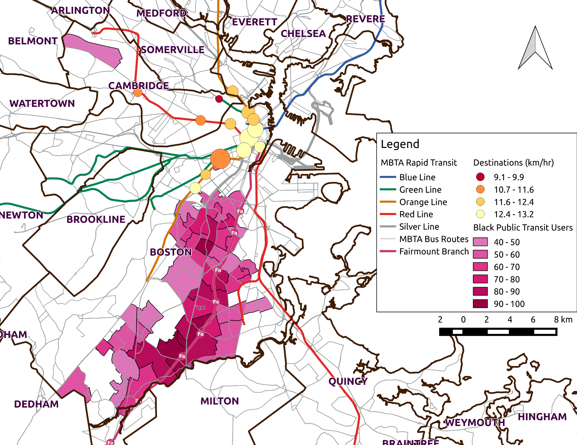
Figure 5.29 Map of Top 15 Destination for Bus->Rail Journeys (Circle Areas Scaled by Demand and Coloured by Average Speed)
This analysis focused exclusively on journeys from home areas as a proxy for the journey to work. It is unclear whether the transit experience of non-regular users would be better or worse, and whether it would affect users of different races or ethnicities differently. For commuters who travel to work after 3PM, it is likely that they face worse service with respect to headways and network connectivity, but may enjoy faster and more reliable bus and train service.
That average trip length doesn’t increase as the concentration of Black or African American public transit commuters increases implies that, on average, the spatial mismatch hypothesis of a mismatch in available jobs and housing for African Americans does not hold on average in Boston. However, it is difficult to determine from the available data whether minorities such as Black commuters in majority White tracts have their needs served equally well by transit. It is possible that Black commuters in White tracts have different travel needs, and thus different travel outcomes.
The surface portion of the Green Line is omitted from this analysis due to an absence of inferred origins and destinations, and consequently travel times. Analysis of the schedules for the central trunk of the Green Line reveals average speeds below those of average subway or bus speeds. An examination of the map in Figure 5.18 shows the surface portion of the Green Line exclusively serving White or tracts meeting neither threshold. Approximately 58% of the surface track mileage is within White tracts. Without inferred origins and travel times it is impossible to include the trips starting in White tracts on the surface Green Line. Assuming evenly distributed origins on the surface portion of the Green Line, the number of fare transactions on the surface originating in White tracts is approximately 5,300 in the weekday AM Peak. Boardings on the Ashmont branch of the Red Line in the AM Peak are only 4,500 per weekday. Therefore the inclusion of surface Green Line trips would likely have a significant decrease on the average speeds for commuters from White tracts and result in a significant reduction in the gap in travel times between Black and White tracts.
The automobile mismatch is based on Black or African Americans having lower auto ownership than Whites. Thus, observations of transit travel may be biased by the ability of many to choose to drive rather than take transit. Service might be equal for all neighborhoods, but outcomes are better for commuters in White Alone areas because only trips that are competitive with the auto are being made. Proportionally more Black or African American commuters may be exclusively dependent on transit for their needs. Williams et al. (2014) controlled for this in their regression, adding a zero-auto household dummy variable. This variable was significant and positive, adding one minute to a commute, which would support the auto selection bias, but did not eliminate the difference in travel time found by their regression. For the samples selected in this study, the proportion of public transit riders without automobile at home was 22.6% for the White Alone sample, and 34.8% for the Black or African American sample. This does not necessarily sidestep equity considerations, however, since it is unclear from the FTA guidance how to consider when ridership demographics do not match service area residential demographics.
Suggestions for Solutions
Changes in Bus Operations
These shorter term solutions require no new capital purchases, merely further study to modify operations to better serve the transportation needs of Black commuters.
Improve Bus Departure Reliability at Terminals
Maltzan (2015) demonstrates that holding strategies to regulate headways on high-frequency bus routes are most effective at the departure terminal. Given that most bus-to-bus transfers for journeys from Black tracts occur at terminals such as Dudley Square and Forest Hills Station, implementing these holding strategies would have multiple benefits. First, regular departure times decrease in-vehicle travel time variability. Second, this would reduce the wait time for users transferring at these stations.
Estimating waiting times for user’s walking up to a bus stop is discussed in Section 5.4.1 above. Estimating transfer times is described in the section entitled
Bus Trips Requiring One or More Transfers above. The decreases in both forms of waiting from regulating departures can be estimated by simulating bus departures under controlled departure strategies at a given terminal such as Dudley or Forest Hills over the course of a day. From the simulated new departure schedule, waiting and transfer times can be estimated as described in the above sections. Aggregating the decreases in journeys gives the overall benefit of controlling departures at Forest Hills and Dudley.
By only examining transfer time in aggregate, it is possible to estimate the impacts of regulating routes for which average transfer time exceeds half the average headway, the theoretical waiting time excluding the time it takes to walk from one bus to the next. By regulating departures at Forest Hills Station and Dudley Square, average journey times decrease by 1 minute for the 6% of trips transferring through those stations who experience longer than expected transfer times. This leads to a decrease of 2% in the overall average journey time difference of 3.1 minutes between commuters from Black tracts and those from White tracts.
Through-routing Buses
Given the higher rate of transfers required for trips from Black tracts, the demand from the southwest through Dudley to the Boston Medical Center into downtown is strong enough that routes ought not to terminate at Dudley. Combining the 28 and the SL4 would be a good candidate, since many commuters transfer from the 28 to the 1 or the SL4/5 to go to the Boston Medical Center or the SL4 to go to Downtown Crossing. This idea is not new: extending the Silver Line to Mattapan was featured in the 2004 Roxbury Strategic Masterplan (Menino & Maloney, 2004). Articulated buses already run the 28, so combining with the SL4 would not reduce the availability of articulated buses on either route. Bus drivers on the 28 currently take their breaks at Mattapan, so drivers of the extended Silver Line could also break at Mattapan, or driver changes would occur in the middle of this combined route at Dudley, and drivers could break there. Journey times would be reduced by an average of 4.1 minutes for transfers to the Silver Line, to 6.8 minutes for transfers to the 1. The overall impact could be between 0.5% and over 1.0% of the overall average journey time difference of 3.1 minutes between commuters from Black tracts and those from White tracts.
The 32 and 39 would be good candidates for a merger since there already exists a variation of the 32 which follows the 39’s route to the Longwood medical area. Only 22% of trips that start on the 32 in this sample do not involve a transfer to another route, although 65% of trips involve a transfer to the Orange Line. The expected benefits of this through-routing would be a 4 minute reduction in travel time and a 0.7% reduction in the overall difference in travel times.
Creating longer routes has some disadvantage, however, since the increased cycle time decreases reliability. Therefore the tradeoff in travel times before and after should be evaluated. This could be a good candidate for piloting, since the results of origin-destination inference will give rapid feedback on the outcomes of the route consolidation.
Fare Policy
Increasing Commuter Rail Access from Hyde Park
Given the large number of riders transferring to the Orange Line from the 32, and that many of these Orange Line trips have destinations that are also Commuter Rail stations (Ruggles and Back Bay), these trips would be faster by commuter rail. Given the proximity between Hyde Park and Fairmount stations, reducing the fare from Hyde Park to Zone 1A, equivalent to the normal transit fare, would be reasonable.
Maintain Free Transfers
Given the much greater need for commuters from Black tracts to transfer in order to complete their journeys, it is critical to maintain the affordability of the system for these users by maintain free bus-to-bus transfers and the nominal step-up fare from bus to rail.
Capital Investment
Rapid Transit Frequencies on the Fairmount
For users currently traveling to South Station, downtown Boston, or stops near the Fairmount Line, travel times could be improved by shifting users to commuter rail on the Fairmount Line, were that line to have Diesel Multiple Units trains operating at frequencies equivalent to heavy rail.
Of the 35,257 farecards in Black tracts, 26% or 9,178 have the centroid of their home location—their most likely residence—within 800m (1/2 mile) of a station on the Fairmount Line, accounting for 23% of the 200 thousand weekday journeys with inferred origins and destinations made by commuters in Black tracts (see Figure 5.30). A further 12.6% of journeys start on bus routes that intersect closely with stations on the Fairmount line, so these trips could easily involve a transfer to the Fairmount if there were travel time savings. This also highlights how low ridership is on routes which intersect the Fairmount: 59.8% of journeys start with a bus stage, but only 38.6% of these are on routes which intersect with the Fairmount. If the line is to become more significant in providing public transit access to the community, the reorganization of bus routes to better feed into the Fairmount ought to be explored further.
Switching focus to destinations, over one quarter of journeys originating within Black tracts end within 800m of a station on the Fairmount. The bulk of these, 17.6% of all trips, end near South Station. In order to estimate the travel time savings of users who would benefit from transferring to or from the Fairmount Line, a network model of the transit network after improvements have been made which can recalculate every user’s shortest path is necessary.
This analysis will first consider trips which can be replaced by a single stage on the Fairmount: trips which start and end within walking distance of the Fairmount, accounting for 5% of all trips starting in Black tracts. For these journeys, the travel time savings of improvements on the Fairmount will be greatest since travel on the Fairmount Line will be a significant portion of the journeys that switch to the line. Including journeys which require a transfer to or from the Fairmount will increase the total number of users benefiting from the improved line, while the individual benefits of switching to the line will decrease due to transfer times. After estimating the travel time savings for trips within walking distance of the Fairmount, the benefits will be extrapolated to a wider set of trips which could benefit from switching to the Fairmount.
The set of Fairmount branch stops is available in the current version of the MBTA’s GTFS feed, excluding the proposed Blue Hill Avenue Station as well as running times between the stops. The location of Blue Hill Avenue Station was added from data provided by MassGIS[8] and running time assumed between it and its neighboring stops. The following assumptions were made for this evaluation:
- Users access origins (Fairmount stations, or bus or subway stations) from the centroid of their home location (the most likely point of residence)
- Users within 800m (½ mile) walk to the Fairmount station
- User walking speed is 3km/hr and walking distances are Euclidean
- Fairmount headways are equivalent to peak Orange Line scheduled headways of 5 minutes
- Travel time to Blue Hill Avenue station is half the travel time between Fairmount Station and Morton Street Station. This extra stop adds 1 minute to the running time. Currently the Fairmount schedule includes no explicit estimate of dwell time: departure time is equal to arrival time.
- Fairmount running times decrease by 16% due to decreased dwell time and faster acceleration versus current equipment (Jacobs Edwards and Kelcey, 2008). Though current scheduled running times on the branch are already the 25 minutes predicted from the introduction of DMUs.
Current travel times are the sum of the observed travel time and, for journeys that start with a bus stage, the estimated waiting time calculated in Section 5.4.1. New travel times are calculated per Equation 54.
Equation 54 Travel Times for Users Switching to the Fairmount Line
[TT_{\text{fairmount}} = Access\ Time + Wait\ Time + \text{Travel\ Time}_{\text{od}} + Egress\ Time]
Where:
[Access\ Time = \frac{\text{Distance\ from\ home\ location\ to\ nearest\ Fairmount\ Station}}{3km/\text{hr\ }}]
[Wait\ Time = \frac{1}{2}*5\ min = 2.5min]
(\text{Travel\ Time}_{\text{od}}): Travel Time from nearest origin Fairmount Station to nearest Fairmount Station to the destination
[Egress\ Time = \frac{\text{Distance\ from\ nearest\ Fairmount\ Station\ to\ destination}}{3km/\text{hr\ }}]
The top 10 OD pairs are listed in below. The general direction is inbound and in particular with South Station as a destination, the total number of trips that end within a walking distance of South Station is 225 per weekday.
Table 5.18 Top 10 Origin-Destination Pairs Within 800m of the Fairmount Line by Ridership
| Origin Station | Destination Station | Monthly Number of Trips |
|---|---|---|
| Newmarket | South Station | 1,204 |
| Four Corners / Geneva | South Station | 924 |
| Morton Street | South Station | 823 |
| Morton Street | Blue Hill Avenue | 685 |
| Uphams Corner | South Station | 674 |
| Four Corners / Geneva | Newmarket | 550 |
| Blue Hill Avenue | South Station | 444 |
| Talbot Avenue | South Station | 434 |
| Uphams Corner | Newmarket | 424 |
| Four Corners / Geneva | Talbot Avenue | 417 |
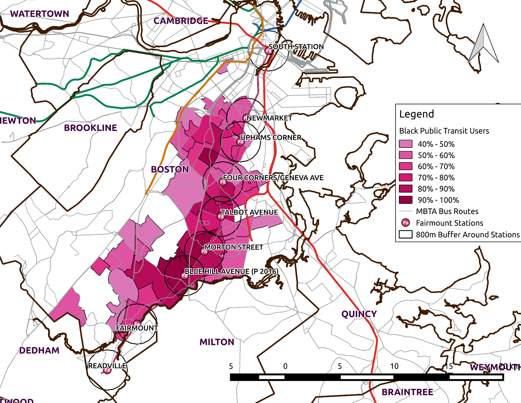
Figure 5.30 Map of Fairmount Stations with 800 m (1/2 mile) Buffer
New travel times are calculated with the assumption that users walk from their home location to the nearest Fairmount station and then travel to the nearest Fairmount station to their original destination and walk to the destination. Under this assumption 50% of trips currently being made along the corridor switch to the Fairmount Line, benefiting from an average travel time decrease of 13.5 minutes. Of the trips making the switch 52% are bus to rail, 44% bus, and 4% are rail. This decreases average travel times in the corridor by 6.8 minutes, from 33.1 minutes to 26.3 minutes. Figure 5.31 shows the distribution of trip times along the corridor before and after. The dramatic decrease in trip times above 45 minutes is notable. Table 5.19 shows the benefits aggregated by the number of segments the original trip had. As the number of segments initially required to travel from origin to destination increases, the benefits of the Fairmount Line and the single-stage journey it offers increases. Only 21% of trips with only one stage switch to the Fairmount Line, but 81% of two-stage journeys benefit from changing to the Fairmount Line.
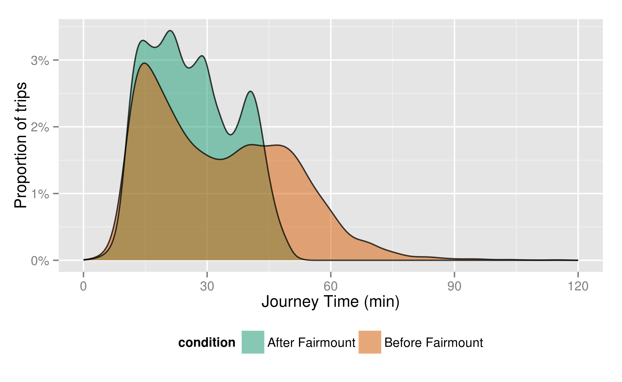
Figure 5.31 Journey Time Distribution for Trips within Fairmount Corridor
Recalculating the overall average journey times taking into account the trips switched to the Fairmount branch for commuters from Black or African American tracts reveals an overall average decrease of 0.3 minutes from 32.6 minutes to 32.3 minutes. This results in a decrease in the gap in average travel times between Black tracts and White tracts by nearly 10%. This is a low estimate of the benefits of these improvements, since the number of users who may want to transfer to or from the Fairmount Line is much higher than the five percent of trips which can be completed by walking to the line.
Table 5.19 Travel Time Savings by Original Trips Number of Segments
| Number of Segments | Proportion who Switch | Proportion who Don’t Switch | Proportion of Trips within Corridor | Average Savings (min) |
|---|---|---|---|---|
| 1 | 21% | 79% | 53% | 7.3 |
| 2 | 81% | 19% | 43% | 14.1 |
| 3 | 99% | 0.9% | 4.2% | 24.1 |
In order to get a closer estimate of the full benefits, the benefits for trips walking to and from the Fairmount Line will be extrapolated for the types of trips listed in Table 5.20. By examining the map of the rapid transit network, trips having destinations within the area in purple in Figure 5.32 are assumed to likely have travel time savings from the Roxbury, Dorchester, Mattapan, Hyde Park area by switching from the Fairmount Line at South Station. These benefits are assumed for users residing within walking distance of a Fairmount station, and for users who make trips on bus routes which intersect the Fairmount Line whose trips currently require two or more segments. Single stage trips to these destinations are unlikely to receive benefits by having to transfer from the Fairmount.
Table 5.20 Types of Trips Used to Extrapolate Fairmount Benefits
| Type of Trip | Proportion of Black Trips |
|---|---|
| Home location within walking distance of Fairmount Line Destination requiring a transfer at South Station (see Figure 5.32) | 4.3% |
| Origin on a bus route intersecting with the Fairmount Line Destination requiring a transfer at South Station | 3.2% |
| Origin on a bus route intersecting with the Fairmount Line Destination within walking distance of Fairmount Line | 1.2% |
Travel time savings will be the same as the average savings for trips with the minimum number of segments required to reach South Station from the same origin station on the Fairmount. Trips that normally require two or more segments to reach South Station will have a 6 minute transfer penalty deducted from the benefits because switching to the Fairmount is unlikely to reduce the number of segments in these trips. In the analysis above, part of the benefits for these the trips came from reducing the number of stages by taking the straighter path on the Fairmount. The benefits are also assumed similarly distributed.
For users transferring through South Station, users whose bus routes intersected with Readville Station were not included because these routes, the 32 and 33, are already relatively fast. Travelling to Readville to catch the Fairmount Line would require substantial backtracking in order to travel to South Station.
Table 5.21 shows the travel time savings by origin station and the proportion of trips from that station which switch to the Fairmount Line. For example, from Uphams Corner, 2 stages are required to reach South Station, and 99% of trips switch to the Fairmount in order to save 7.4 minutes of travel time on average. Because of differing connectivity to bus routes to South Station as well as to the Orange and Red Line, the savings are not distributed in the same order as the distance from the stations to South Station.
Table 5.21 Travel Time Savings to South Station, by Origin Station on the Fairmount
| Origin Station | Number of Segments | Average Travel Time Savings | Proportion who Switch |
|---|---|---|---|
| Newmarket | 1 | 5.9 | 4% |
| Uphams Corner | 2 | 7.4 | 99% |
| Four Corners / Geneva | 2 | 10 | 100% |
| Talbot Avenue | 1 | 12 | 95% |
| Blue Hill Avenue | 2 | 14 | 100% |
| Morton Street | 2 | 15 | 100% |
| Fairmount | 3 | 17 | 100% |
For users who take a bus that intersects with the Fairmount in order to access destinations by walking from a station, a similar table to Table 5.21 was constructed, but using all origin and destination stations on the Fairmount Line. The same transfer penalty was applied for Fairmount OD pairs where the shortest path outside the Fairmount involves one or more transfers.
The results for the three types of trips are in Table 5.22 below. The aggregate travel time savings are more substantial for the users who can walk to the Fairmount because they are nearer to stations where a greater proportion of users would switch to the new Fairmount Line. Users who take buses to the Fairmount, on the contrary, take routes near stations where the network is such that fewer of them might transfer to the Fairmount.
Table 5.22 Travel Time Benefits from Switching to the Fairmount Line by Trip Type
| Trip Type | Average Time Saved (min) | Number of Morning Trips that Might Switch to Fairmount (% of all Black Trips) | Impact on Travel Time Differential |
|---|---|---|---|
| Origin and Destination within walking distance of Fairmount Line | 13.4 | 4900 (2.5%) | 10% |
| Home location within walking distance of Fairmount Line Destination requiring a transfer at South Station | 12.4 | 7900 (4.0%) | 16% |
| Origin on a bus route intersecting with the Fairmount Line Destination requiring a transfer at South Station | 12.2 | 2600 (1.3%) | 5.2% |
| Origin on a bus route intersecting with the Fairmount Line Destination within walking distance of Fairmount Line | 12.1 | 1600 (0.8%) | 3.2% |
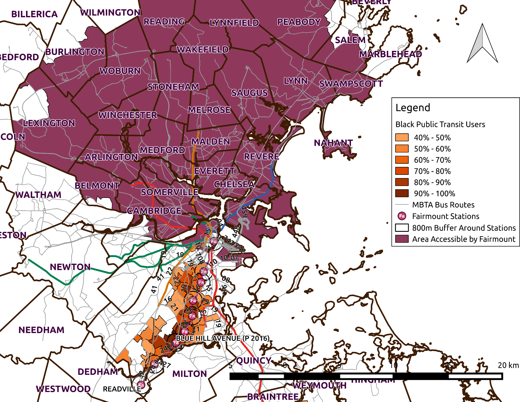
Figure 5.32 Map of Destination Area for Which Transferring to Fairmount Line Might Provide Travel TIme Benefits
Summing all the potential benefits together brings an aggregate impact of a reduction of nearly 35% in the travel time difference between commuters from Black tracts and commuters from White tracts. Given the potential, this warrants more disaggregate analysis to fully estimate the benefits by modelling the paths of all trips to determine individual benefits. With a shortest-path model of the transit network it would be possible to estimate the new travel times for each individual and recalculate average travel times as above. Beyond the short-term travel time benefits, the analysis should consider how making accessible destinations for which travel took too long may result in users changing their travel patterns and employment. In particular, the Seaport District, which is a short walk or ride on the Silver Line from South Station, is rapidly growing (Gordon, 2015). The Fairmount provides good access to these new jobs becoming available in the coming years. Additionally, access to job centers such as the Longwood Medical Area and Copley Square by transferring from the Fairmount to buses to these areas should be further investigated.
Heavy Rail
The difference in journey time between the Ashmont branch and the trunk of the Red Line will always exist due to there being fewer trains operating on a branch. However, frequencies could be increased on the Ashmont branch in the early morning, when a greater proportion of commuters from Black tracts travelling at that hour are on the Red Line compared to the Orange. With the increased frequencies offered by modern signaling equipment and a larger fleet of vehicles, both the Ashmont branch of the Red Line and the Orange Line could decrease journey times through decreased waiting time. The benefits of reduced headways on travel times can be estimated at the disaggregate level by:
- estimating individual waiting times as the time between fare payment at a station and the first train bound for the user’s destination
- creating a new GTFS schedule with the new headway(s)
- re-estimating individual waiting times as per step 1 with the new schedule
- comparing the difference in waiting times
Buses
A deeper analysis of bus usage by Black riders using the inferred OD should be undertaken to determine how bus routes could better serve current and future needs. The benefits and tradeoffs of interventions such as increasing frequency, performing BRT interventions to increase vehicle speeds such as transit signal priority, and consolidating routes to reduce the number of required transfers should be incorporated into such a study. This could be performed using transportation network analysis software.
Housing Affordability and Displacement
Though housing affordability is not in the mission of the MBTA, it would be remiss to propose these solutions without a warning about the link between transit access and housing affordability. There are concerns that increased accessibility from the Green Line Extension into Somerville will raise rents such that low and moderate income families will be forced to move to areas with decreased accessibility (Metropolitan Area Planning Council, 2014). Similar displacement forces may affect Black or African American residents in the sample area used in this analysis. It would be unfortunate if improvements to right inequities in access resulted in displacing residents to regions of similar or worse accessibility. Therefore, cooperation is required with agencies responsible for the protection of housing affordability when implementing these proposed solutions.
Suggestions for Future Spatial Analyses
The analysis described in this chapter should be repeated with other transit riders from other minorities, treating them by racial or ethnic category rather than as a homogeneous group to determine how outcomes are different by race. This analysis could also be repeated with Hispanic commuters, or low-income commuters, but not both characteristics simultaneously. The intersection, or combination, of the aforementioned characteristics by individual is difficult to analyze with the ACS’s data at the Census Tract level because each category is aggregated independently. One could look at tracts with high concentrations of Hispanic persons, and high concentrations of Black persons, but this does not necessarily imply a high concentration of persons who are both Hispanic and Black. The use of inferred home locations linked to census tracts will be difficult with groups who are not numerous such as Native Americans, or groups who are well dispersed with the rest of the commuting population.
There are other corridors which have high concentrations of minority riders and are located in between rail lines. For example, the area of Everett, Chelsea and sections of Revere is similar to the Roxbury, Mattapan, Hyde Park corridor and is also disconnected from Downtown Boston by water. A similar study of that area with OD data may reveal similar travel time differences and may suggest operational improvements to bus routes or introduction of DMU service on commuter rail lines that could benefit commuters in those areas.
Future analysis by the MBTA could incorporate inferred OD and be compliant with FTA regulations by adopting new performance standards based on passenger-centric metrics such as journey time reliability, journey speed, or journey time. The FTA requirement is to focus on all users, not just commuters, so the AFC sample would be expanded to include all trips and the source of demographic information would be residential proportions based on Census or ACS data by block group. Though heterogeneity within tracts was not perceived to be an issue in this analysis, whether minority individuals in White majority tracts have different transit outcomes than their White neighbors should be investigated. This would ideally be achieved by including a question requesting the respondent’s farecard ID in subsequent Title VI & EJ Systemwide Surveys, as has previously been piloted at the MBTA (Chow, 2014). Linking observed farecard travel to survey responses would have a number of co-benefits beyond being able to make a direct link between respondents’ demographics and their travel. A prompted-recall survey asking respondents their prior travel by presenting them their previous travel would provide a large scale validation of OD inference. By collecting respondents’ home addresses or nearest intersections, the home location inference algorithm presented in Chapter 4 could be validated and refined.
Summary
This chapter has demonstrated an application of 21 weekdays of OD data to analyze the spatial variation of transit service between areas with high concentrations of Black or African American transit commuters and area with high concentrations of White Alone transit commuters. Using the 2013 American Community Survey 5-year estimates, the demographics of possible samples were compared over the range of possible thresholds. From this analysis, stricter thresholds than the FTA-prescribed ones were selected in order to ensure a high enough concentration of the target demographics. A sensitivity analysis of the thresholds show that speeds tend to decrease, and travel time increase, as the concentration of Black and African Americans increases, despite distances remaining constant. The proportion of trips requiring one or more transfers also increases as the concentration increases.
Based on the sensitivity analysis, thresholds of 40% Black or African American and 70% White Alone were chosen for respective samples for a more in-depth analysis. There is a persistent difference in travel time and speed (Table 5.23), though differences in travel time are not as great as those previously reported for the Boston Metropolitan Area (Williams et al., 2014). There is a far greater need for commuters in Black or African tracts to transfer to complete trips over similar distances to commuters from White Alone tracts, resulting in lower average speeds. This results in trips that take longer for rail and the combination of bus and rail, despite shorter average travel distances. It also leads to substantially lower speeds and longer trips for bus trips between 6 and 11km, 13% of trips from Black tracts. Shorter bus trips, the bulk of bus trips, have no difference in average speeds.
Table 5.23 Average Journey Characteristics by Mode and Black-White Home Location
| Mode | Bus | Mixed | Rail |
|————————————-|—————————|————-|—————————|
| Threshold | Black or African American | White Alone | Black or African American |
| Average Straight Line Speed (km/hr) | 12.7 | 14.5 | 11.9 |
| Average Journey Time (min) | 19.2 | 18.2 | 43.7 |
Wait times were estimated for bus stages, which resulted in journey times in Table 5.24 below, increasing the difference in bus travel times, but decreasing the gap for users taking bus to rail. Averaging travel times across modes results in average travel times of 32.6 minutes for commuters from Black tracts to the average travel time of 29.5 minutes.
Based on these findings, some recommendations were made and evaluated for interventions which could mitigate the 3.1 minute difference in average journey times which are summarized in Table 5.25. Given the high number of bus to bus transfers, interventions to reduce transfer times through regulating bus departures or by through-routing bus routes at the major transfer stations of Dudley Square and Forest Hills Station. Also suggested is the extension of the Silver Line Washington St. from Dudley Square to Grove Hall or further to Mattapan Square in order to provide a greater number of single-stage journeys for passengers. Additionally, increasing access to the Providence/Stoughton and Fairmount commuter rail lines with reduced fares should be further investigated.
Table 5.24 Journey Time and Speed by Mode and Threshold with Wait Times Included
| Mode | Bus | Mixed | Rail | |||
| Threshold | Black or African American | White Alone | Black or African American | White Alone | Black or African American | White Alone |
| Average Speed (km/hr) | 7.9 | 9.4 | 10.3 | 10.8 | 12.4 | 12.8 |
| Average Journey Time (min) | 26.8 | 25.5 | 50.5 | 48.1 | 27.3 | 25.4 |
The greatest potential travel time benefit for commuters from Black tracts would come from increasing frequencies and speeds on the Fairmount Line by introducing DMUs. This was investigated in disaggregate for users who could walk to and from the Fairmount Line in order to complete their journeys. For those individuals, journey times for those who switched to the Fairmount decreased by an average of 13.5 minutes, primarily trips that involved transferring from bus to rail, leading to an estimated reduction in the travel time difference of 10%. These benefits were extrapolated to those who could walk to a Fairmount Station and whose destinations were well-served by a transfer at South Station. Considering all trips which begin within walking distance of a Fairmount Station leads to an estimated reduction of up to 25% of the current travel time difference. Because the walk-only trips represent only a portion of the trips which could benefit from the Fairmount Line, their benefits were also extrapolated in aggregate for other trips that would use intersecting bus lines and could benefit from transferring to the Fairmount Line. This led to the upper bound of estimated potential travel time difference reduction of 35%.
Table 5.25 Summary of Potential Solutions
| Potential Solution | Potential Impact on Travel Time Difference (% of Current Gap) | Comments | |
| Operations | Improve Bus Departure Reliability at Dudley and Forest Hills | 2% | Doesn’t include wait time reductions for users starting journeys at those stations. |
| Through-routing most Heavily Used Bus Route Pairs | 0.3%-1.0% per route | ||
| Fare | Reduce Commuter Rail Fares at Hyde Park | Further analysis required | |
| Capital Improvements | Rapid Transit Frequencies on the Fairmount Line | 25-35% | Use of a network model to examine all disaggregate benefits to users who could use the line required. |
| Increase Heavy Rail Frequencies on Orange Line and Ashmont Branch | Further analysis required | ||
| Reconfigure Bus Network | Further analysis required |
Examine bus speed
improvements from BRT Examine benefits from reorganizing bus network to reduce transfers |
Given the magnitude of the potential benefits, and the assumptions required to estimating them, a fully disaggregated analysis of the benefits is recommended. This would require a model of the new transit network with a shortest-path routing algorithm to reassign users to shorter trips using the Fairmount and should consider changing trip patterns from increased accessibility as well as economic growth in nearby areas such as the Seaport District.